GE Digital
GE Digital, a division of General Electric, specialized in industrial software and digital transformation across various sectors.
I led the design of "MyTech," a B2B2C application for office equipment inventory management. My role involved managing data processes, creating a user-friendly marketplace UI, and tracking employee devices to optimize company spend. I also gathered stakeholder input, led a design team of 10, and oversaw daily standups and designer mentoring.
Agency
General Electric Digital
Role
Sr. Staff User Experience Manager
Services
UI, UX, Direct Reports, SaaS B2B2C,

Imagine managing thousands of employees, each with unique needs that your organization must meet upon their arrival. Every new hire needs essential equipment such as a computer, mouse, keyboard, and cell phone. Now, multiply these needs by thousands and consider how to effectively track company usage and expenses. Additionally, different employees require different setups to perform their tasks. Not everyone needs expensive Mac computers or smartphones.
With MyTech, you can restrict employees' access to certain devices or require management approval for higher expenses. When designing this UI, my goal was to create a simple left-rail navigation system. This system can collapse various parent and child selections, maximizing the viewing area for products and utilities.
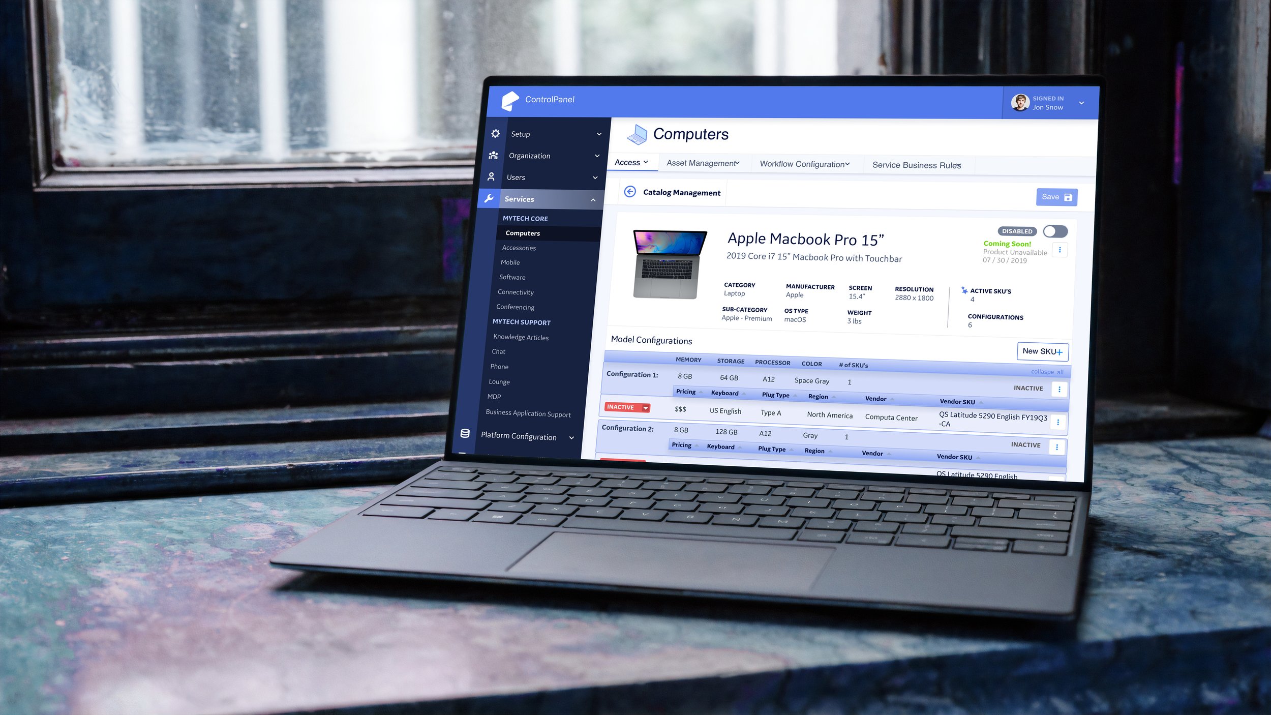
Standardizing the UI was crucial for scalability as new features were added. The vertical icon navigation on the left opens an expandable accordion menu, displaying a scrollable content window on the right. This layout ensures flexibility in feature implementation while maintaining an intuitive, low-learning-curve experience for users.
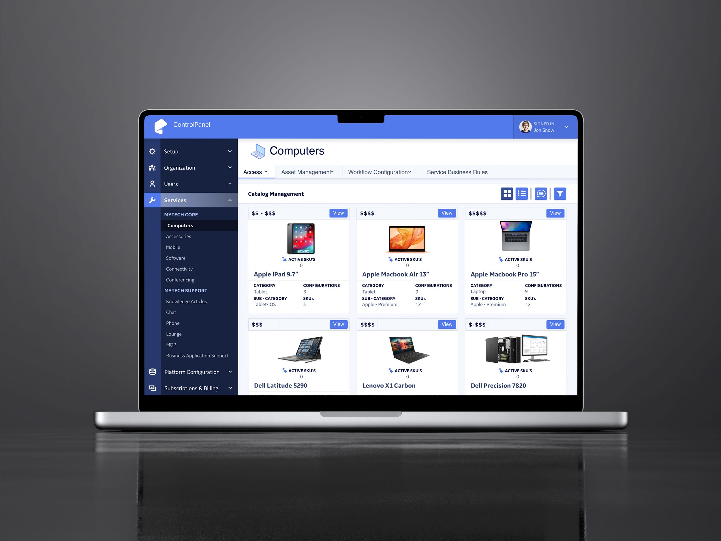
Computers selection page
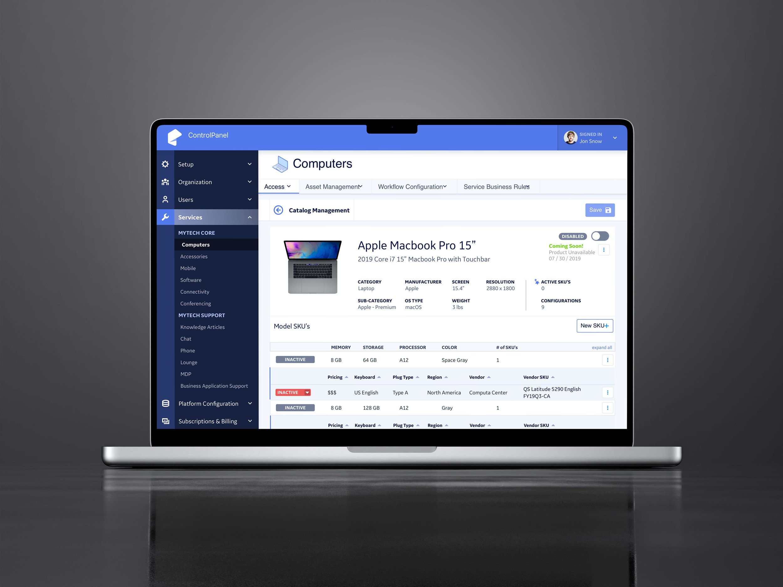
Computer selected with variants
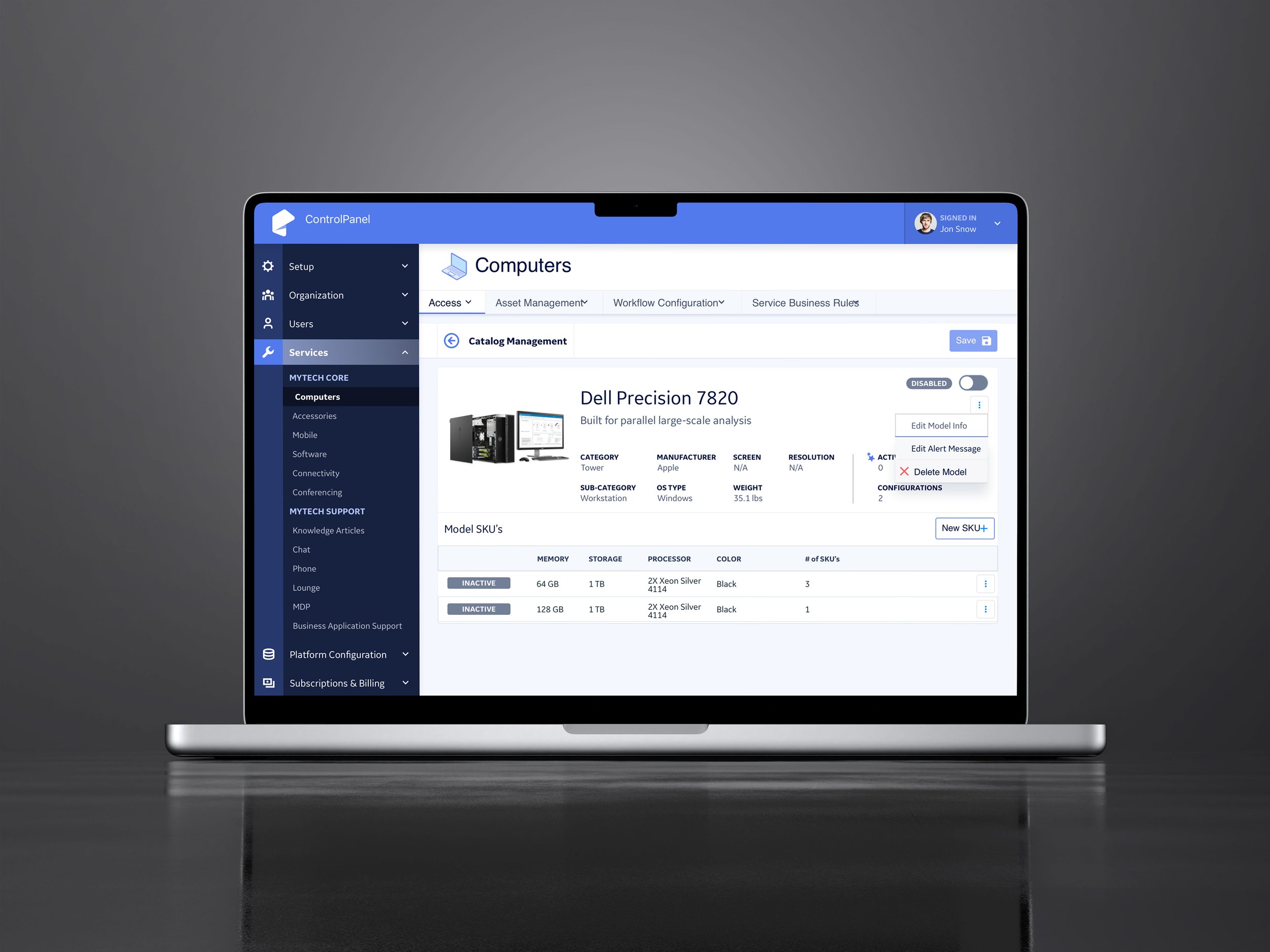
Computer selected with variants
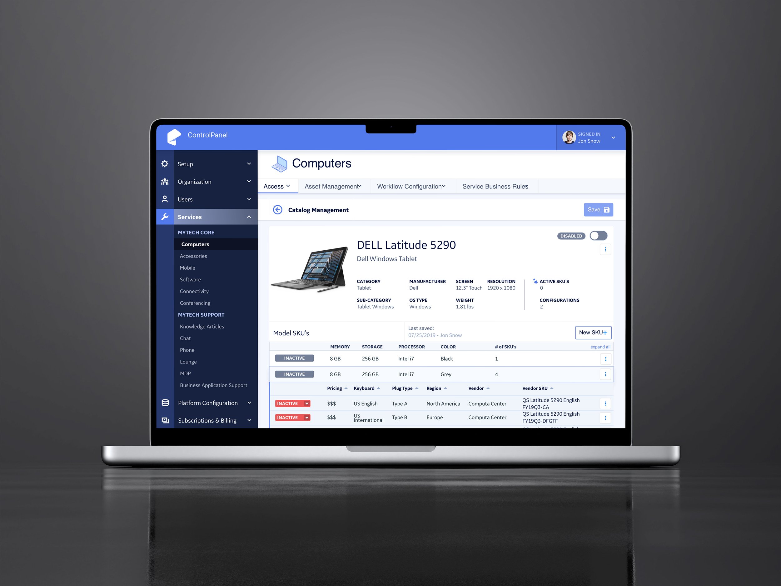
Computer selected with variants
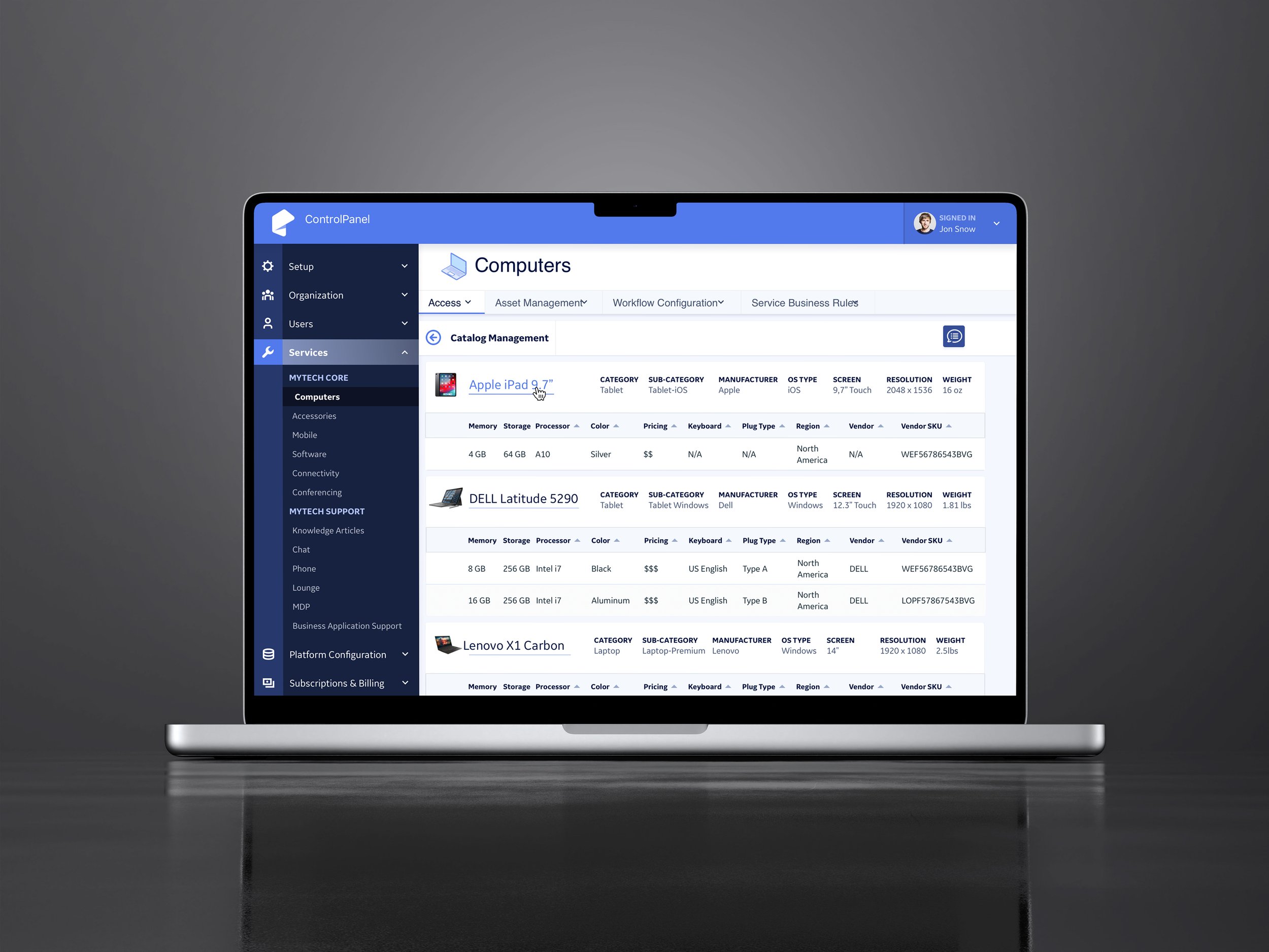
Alt view of computer selections
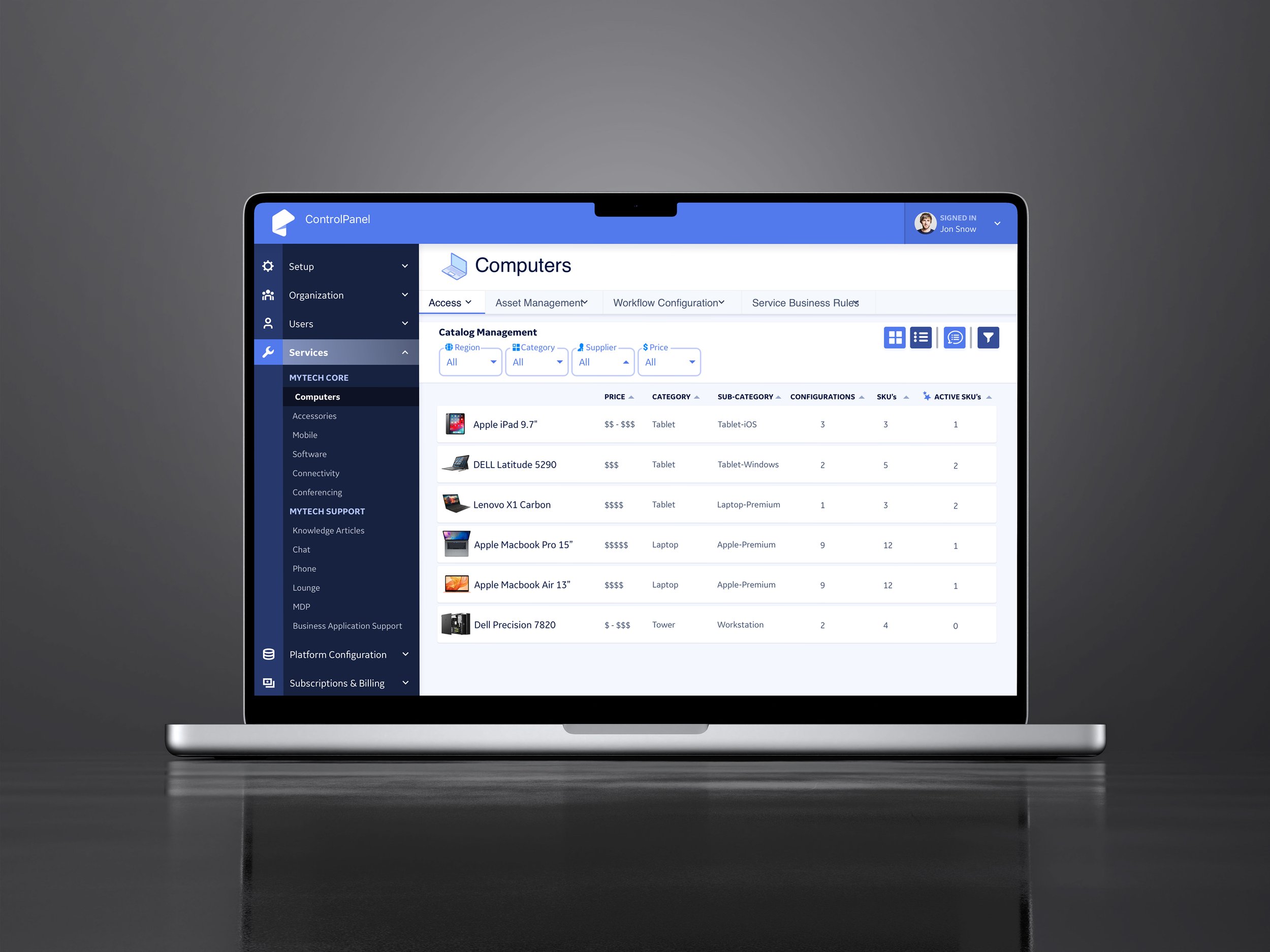
list view of computer selections
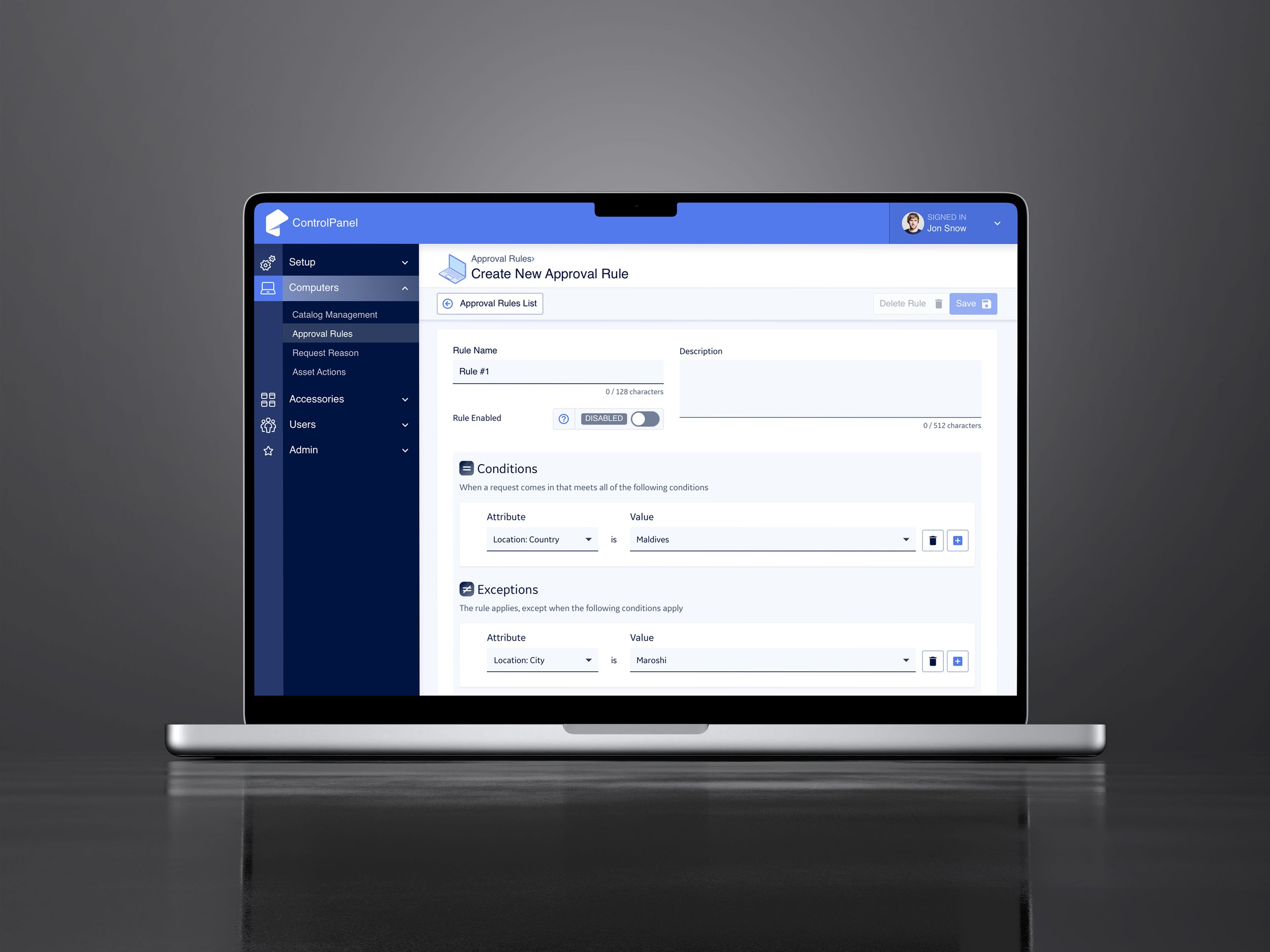
Creating logic rules
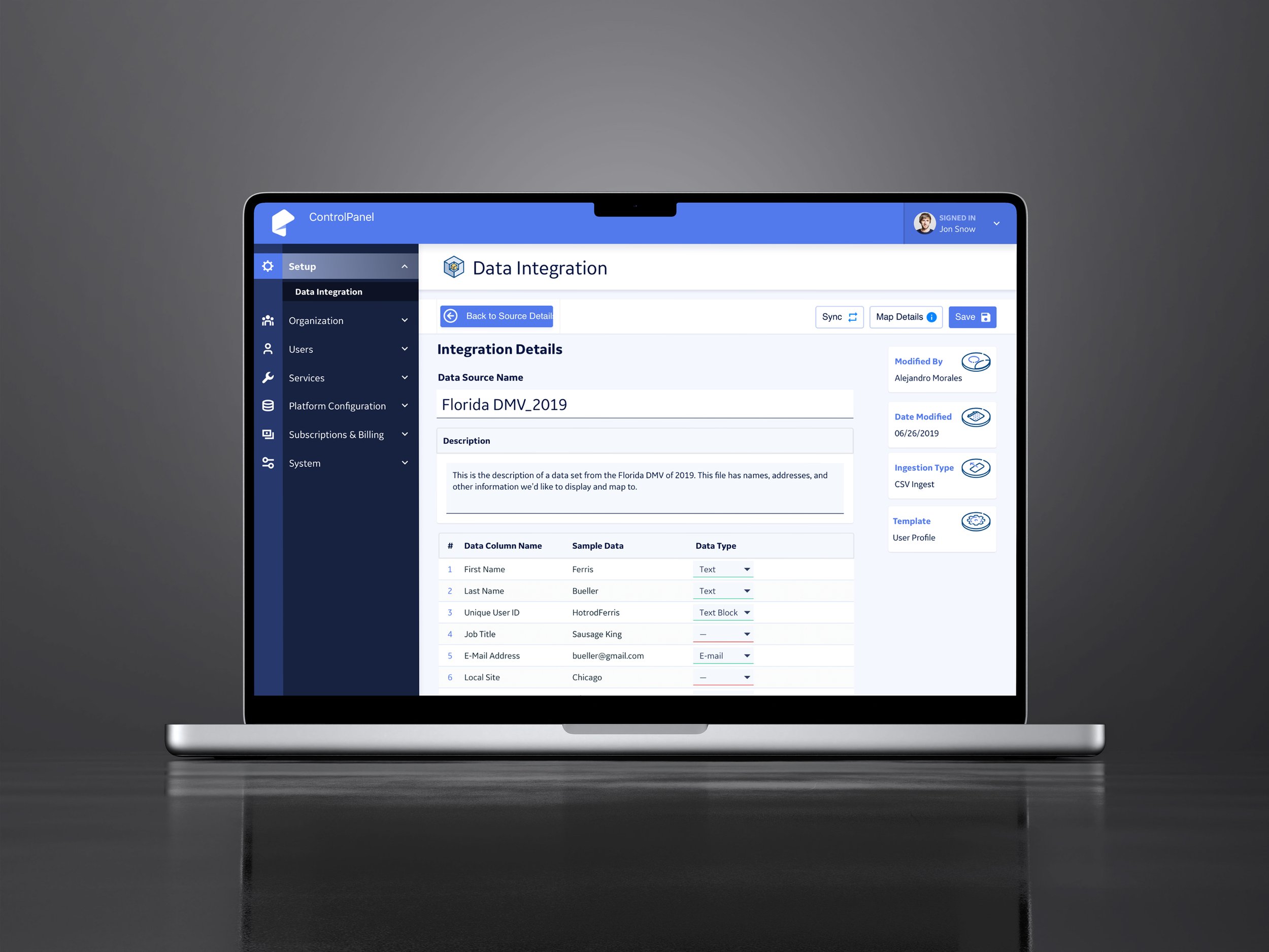
Integrating a data source
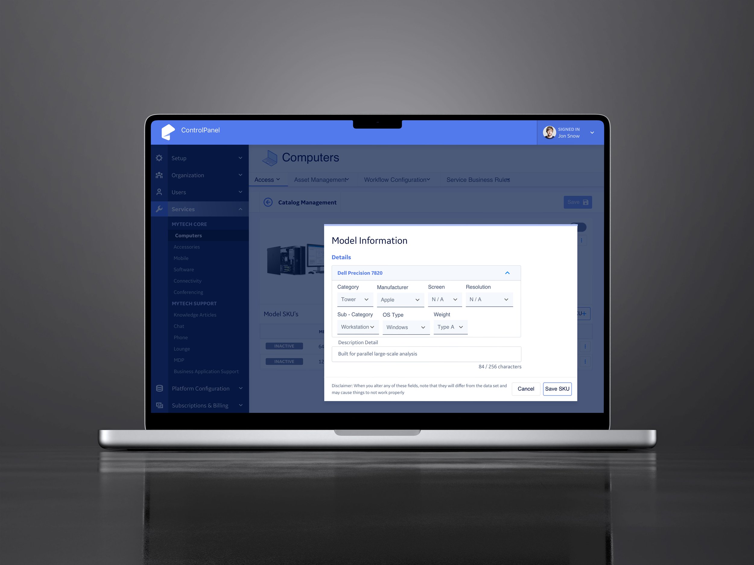
Configuring your asset
Simplifying Data Management
Businesses can upload their datasets via CSV or Elasticsearch. Our system accurately parses data to display SKU data, personnel information, and tracks asset ownership duration. Through this prototype walkthrough you can understand data ingestion, mapping, and template integration.
Approvals
Step by step admin UI to allow for overrides and approvals to work. tep admin UI to allow for overrides and approvals to work.
MyTech, involved over 500 wireframes and numerous edge cases, developed through extensive whiteboard sessions and post-it mapping exercises to ensure the right features. The application included a robust control panel for managing data sources, mapping, and templates, along with a sophisticated permission system that controls visibility from administrators to new hires.

Once the wireframes are finalized, I create high-fidelity, scaled web mockups. The project was ultimately streamlined to around 350 pages. Establishing a cohesive color scheme and brand, along with a comprehensive design system, was crucial in developing this application. Research indicated that blue is the most desirable color for web experiences, so we selected visually appealing colors and readable web fonts, allowing the CMS to manage SKU images effectively.
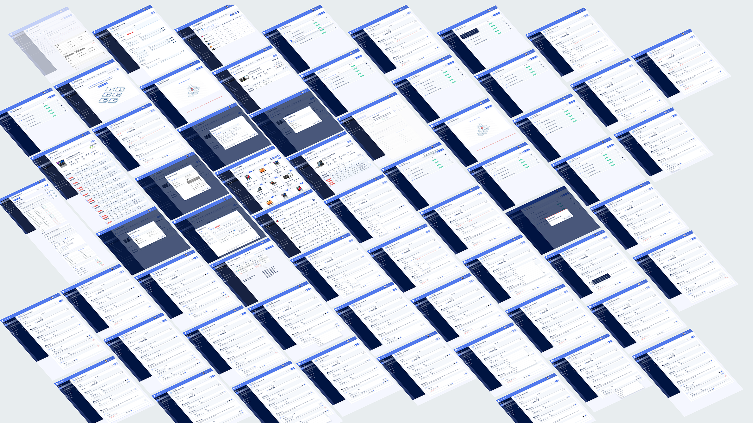

The pages feature strong saturation and simple font selections, making tables and forms easier on the eyes for customers. By applying the principle of Occam's Razor, we simplified this complex application, reducing the actions required from customers to complete tasks. This streamlined approach results in a less stressful experience for users handling internal tasks.

Early Wipeboard sessions front end user UI

Post It Note Affinity Mapping exercises

Mock Up UI feature updates
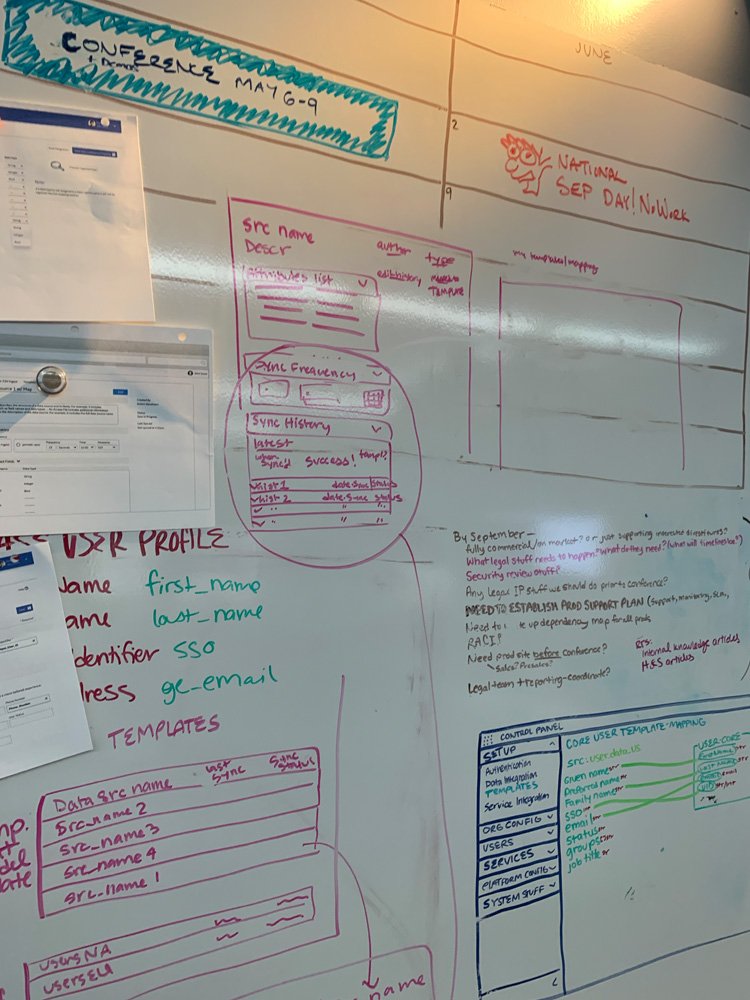
Understanding Data Ingestion
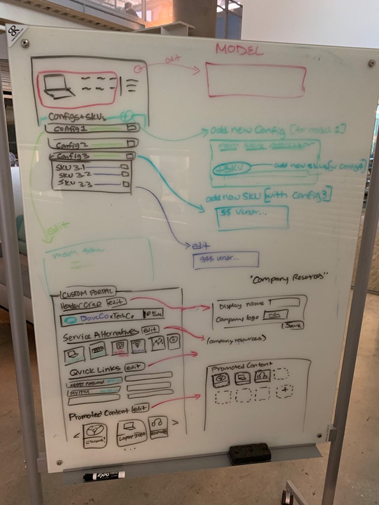
Product Details Wipeboarding

