Hilton Grand Vacations
Hilton Grand Vacations (HGV) is a leading timeshare company offering vacation ownership opportunities worldwide.
As a Principle Product Designer, I optimized the booking and reservation process, established a unified design system in Figma, and led the creative direction for merging two timeshare acquisitions into a streamlined platform—solidifying HGV's position as an industry leader. I also managed the design team, initiated scrum, and developed protocols for seamless design-to-development handoffs.
Agency
Hilton Grand Vacations
Role
Principle Product Designer, Scrum Master, Vendor liaison
Services
UI, UX, CX, UR
Hilton Grand Vacations wanted to establish an easy to use interaction model that would correlate to its parent company Hilton. A more airy look and feel with tile based images and a modular construct for plug n' play to keep things fresh and easily replaceable were driving factors to help provide maximum flexibility long term.
Allowing for much smaller digestible chunks of information at a time gave this approach a more soothing and calming demeanor to an older audience where the technology would do the heavy lifting on the back-end to execute tasks easier.


After interviewing several owners about their current and past experiences and understanding that almost all owners were Hilton Honors members and were very familiar with the mobile app and site for booking hotel choices, I had a baseline understanding to use as a precursor of how far I could push the design to modern approaches. Big margins, usage of mixed Gotham bold and book font styles really helped sell the brand identity forward while adhering to common interactions they were used to I found a sweet spot on the redesign and rebuild.
Our mobile experiences for timeshares begin with showcasing resorts and destinations, aiming to provide a similar look and feel to Hilton.com or Hilton Honors, our parent company. We've incorporated ample airy space around images and body copy, giving the resort section a warm and inviting atmosphere.
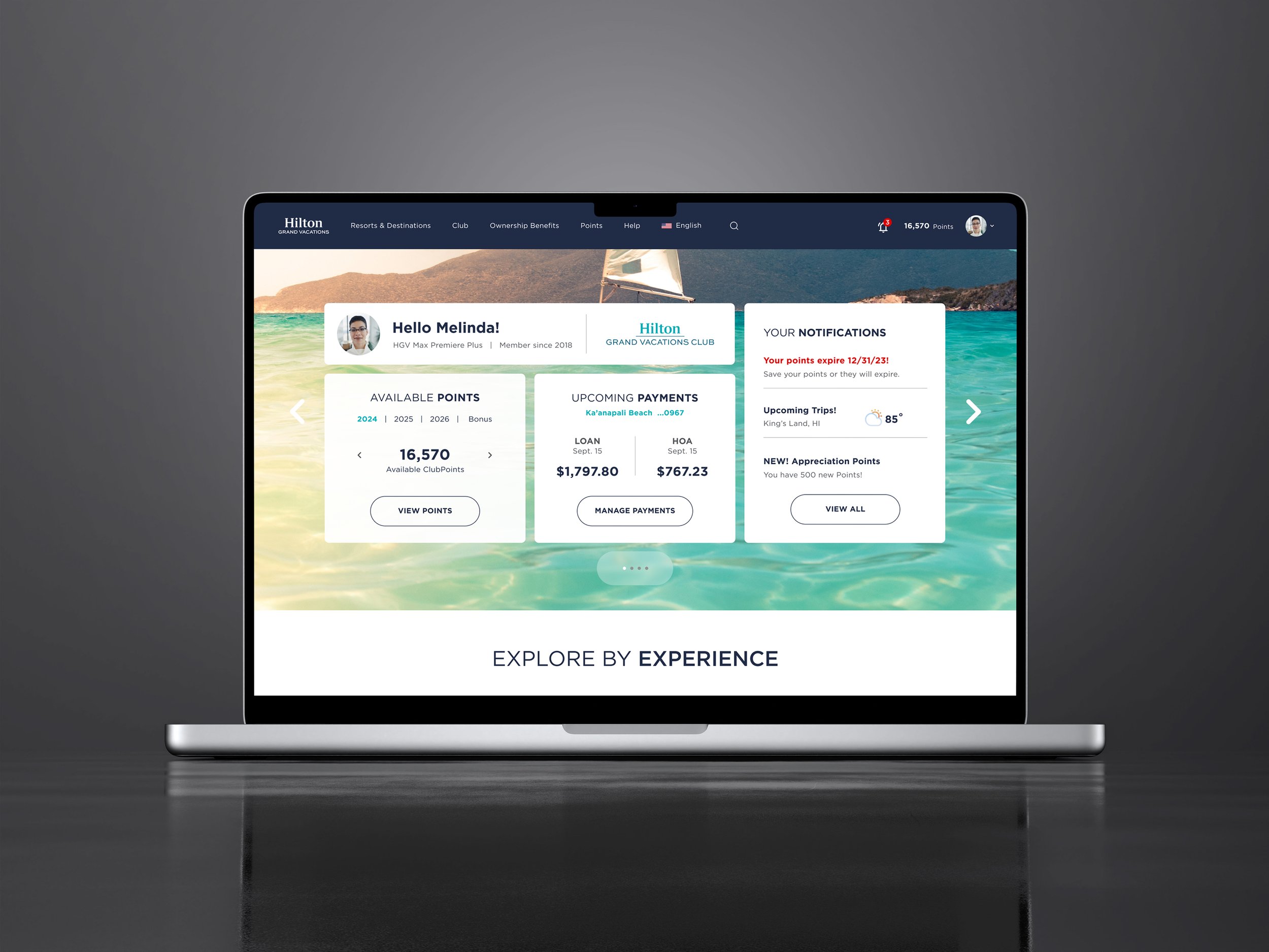
A key pillar in enhancing the customer experience was personalization powered by machine learning. This example showcases how the mobile dashboard adapts to each user's unique needs with modular, tiled elements and browsing options tailored to their specific interests.
Vertical scrolling and flow-based design have become standard in this mobile UI to enhance scan-ability and reduce friction. Previous interfaces for timeshare owners caused cognitive overload, making it difficult to complete reservation bookings. Poor layout and hidden ownership features led to a spike in customer care calls. By restructuring the layout to offload cognitive burden and improving taxonomy to highlight key actions—like reservation history, profile, and benefits—we significantly reduced support calls and increased reservation completion rates.
Owners frequently voiced frustration regarding the accumulation, expenditure, and conversion of points, as well as accessing everyday usage information effectively. My designs addressed these issues by prominently displaying point balances and details based on years, and implementing various sorting functions for points activity. Additionally, I enhanced user engagement by introducing prominent action buttons for point usage, exchange, and purchase, leading to decreased call center inquiries and improved task completion rates.


