The Third Floor: Cyclops
Cyclops AR, recipient of the prestigious 2021 Lumiere Award, stands as an unparalleled Augmented Reality experience for iOS users. Through this innovative app, users can seamlessly integrate computer-generated objects into their surroundings in real-time, enhancing their visual experiences.
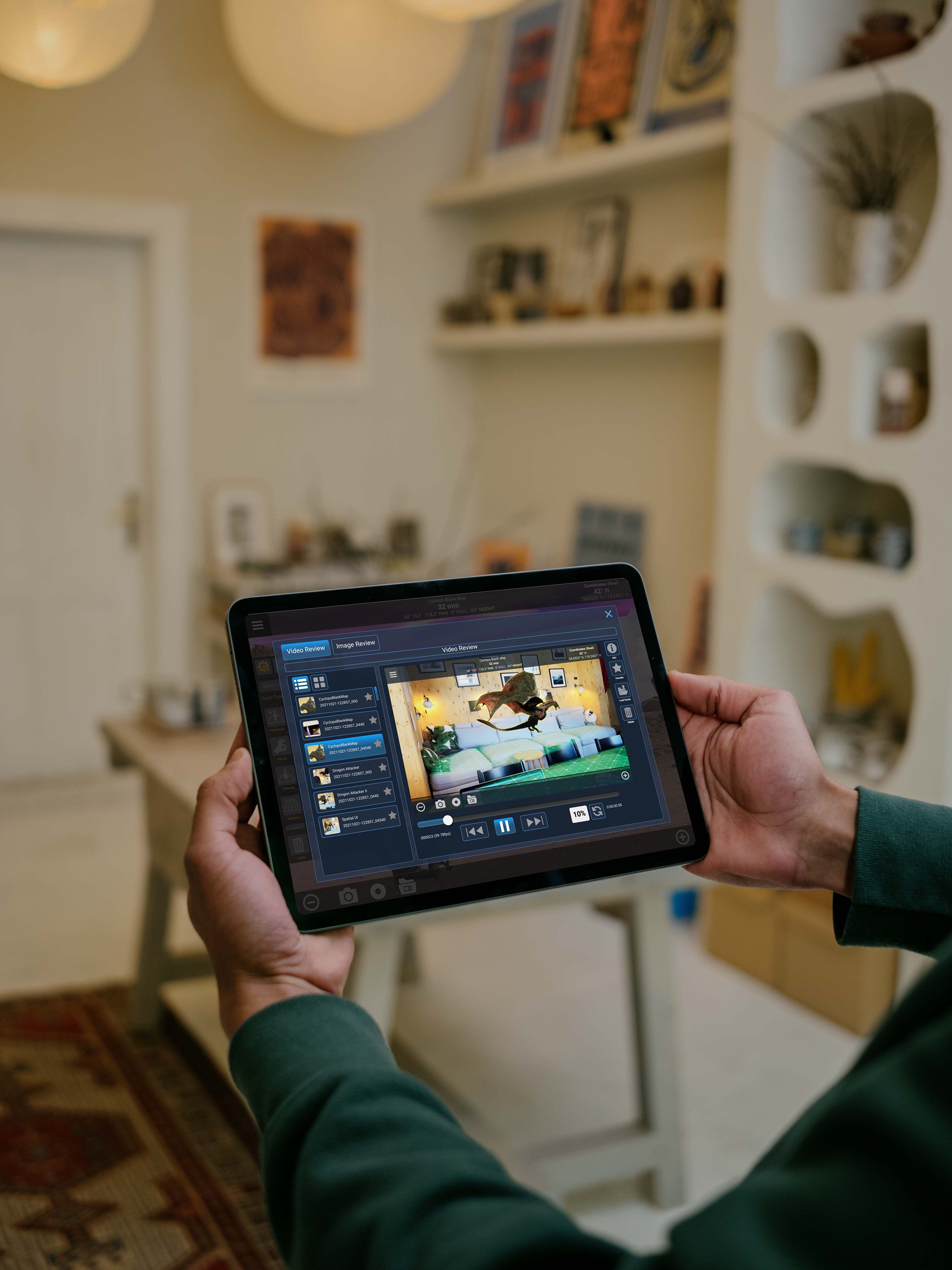
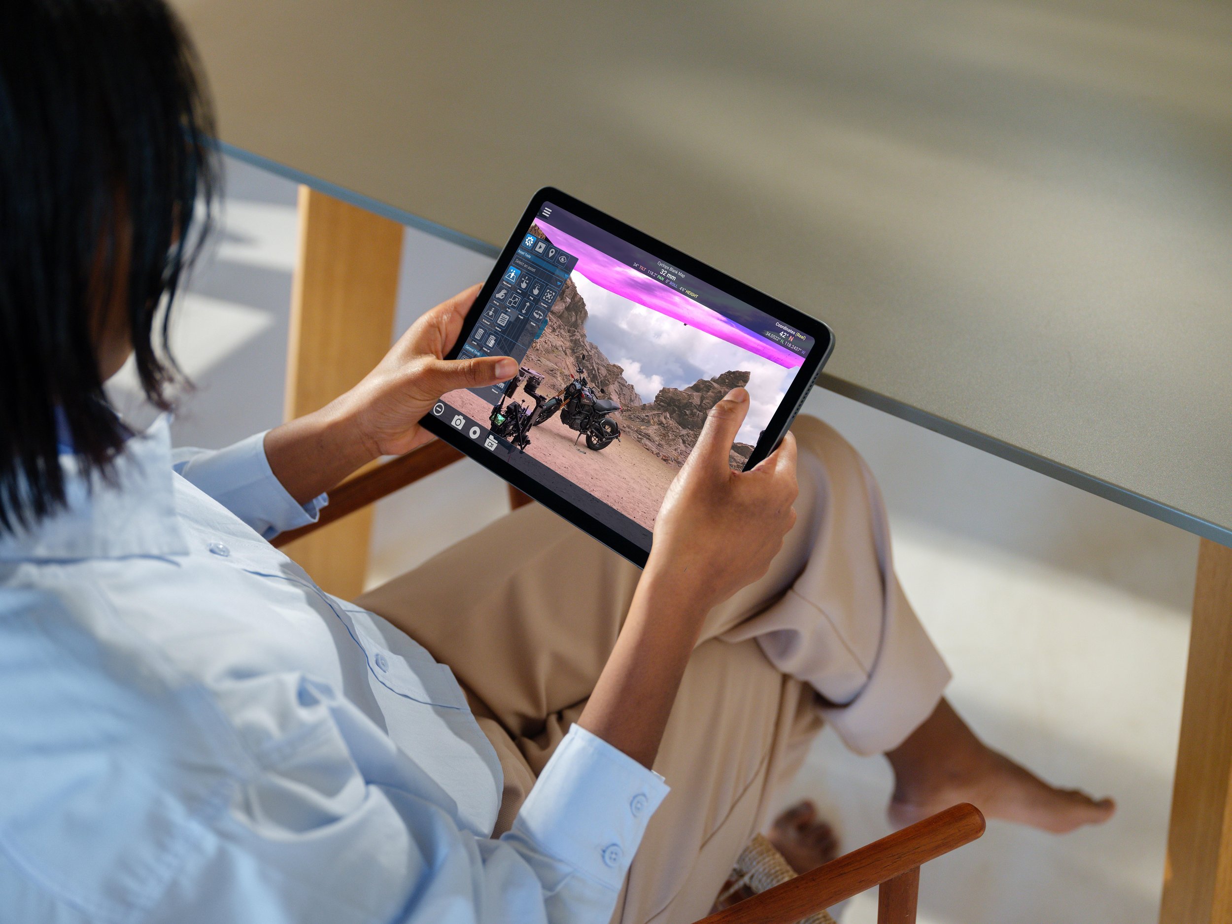
My role involved collaborating with filmmakers, directors, and special effects engineers to refine the app's usability and functionality. Specifically, I focused on optimizing the app's ergonomics and haptic movements, ensuring a seamless user experience while holding the tablet with two hands and projecting it forward for optimal stimulus. Whether on-location or in a studio setting, users can effortlessly position objects for depth of field or capture screen stills for future reference.
Agency
The Third Floor
Role
Sr. Lead Product Designer, Tablet UI
Services
UI, UX, UR, User Testing, Device Testing
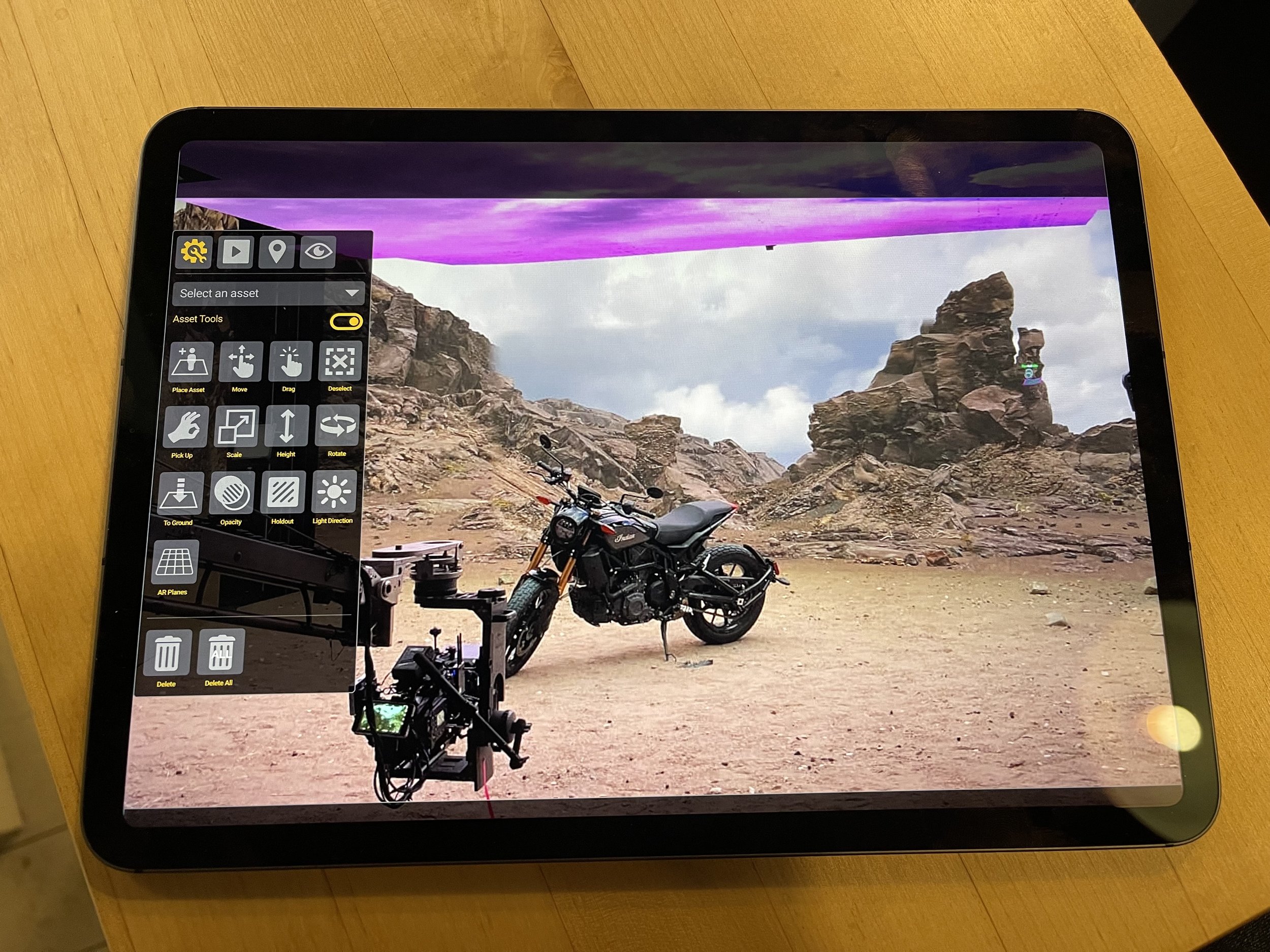
Cyclops is a streamlined simulcam solution, able to be deployed on hand-held devices. Using Cyclops, filmmakers and their teams can easily visualize CG assets at a real set or location and get a sense of the VFX action being shot.
Designing the user interface posed unique challenges, considering the mobility restrictions inherent in tablet usage. To address this, I implemented intuitive features such as slide-out drawers, a user-friendly controller, and large buttons, providing users with flexibility and ease of navigation within the application. Cyclops AR represents a groundbreaking fusion of technology and creativity, empowering users to unlock new realms of visual storytelling.


In the development of Cyclops, extensive device testing was paramount. Although designing an app in Figma is straightforward, ensuring optimal usability while using two hands remained a central concern. Given the app's emphasis on mobility and ergonomics—holding the device with two hands and directing the camera—it was crucial to consider physical constraints, such as thumb and index finger dexterity.
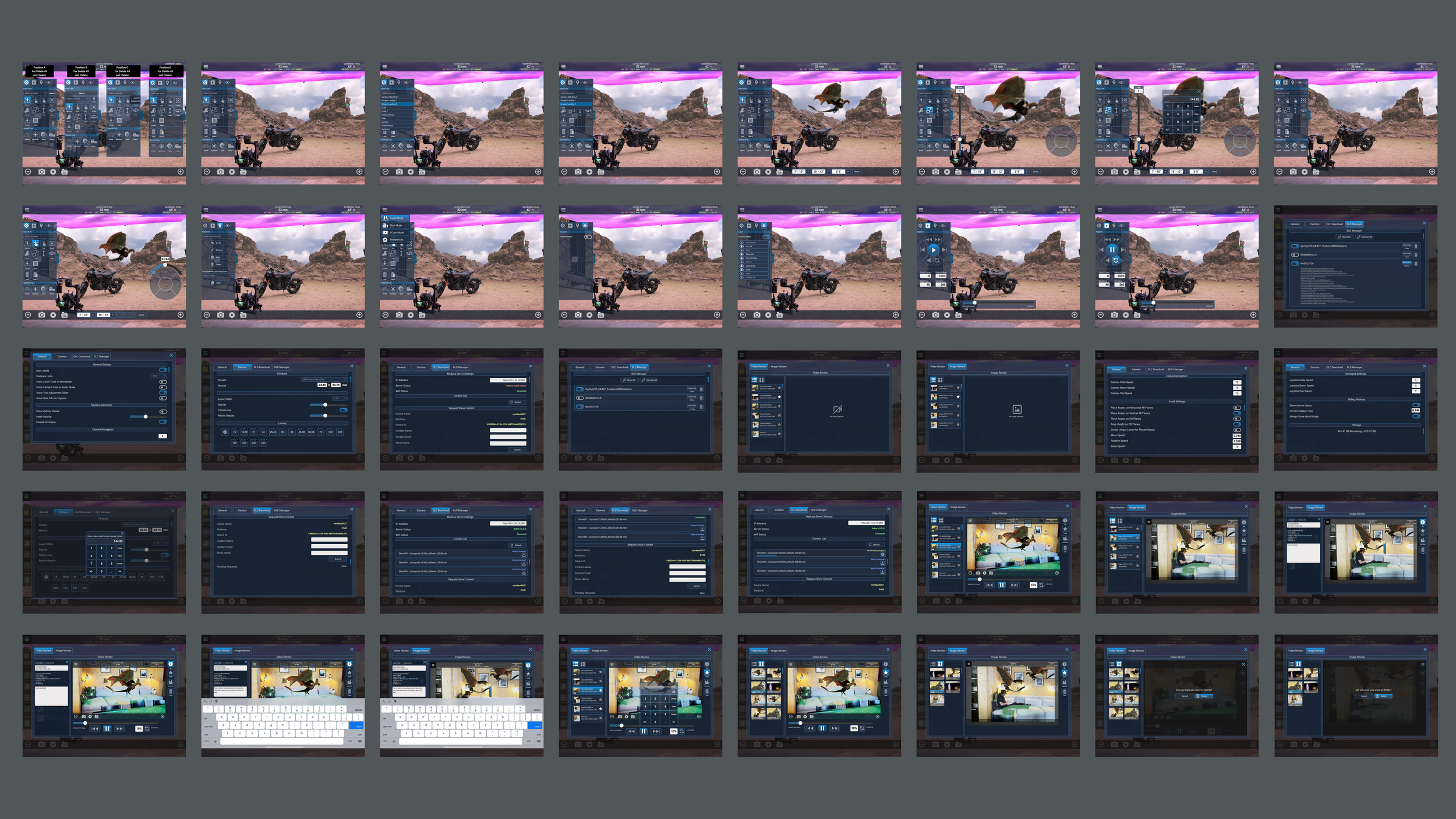
Addressing these challenges involved designing intuitive features for navigating the app, including tap gestures for closing menus and customizable directional controllers. Incorporating larger buttons, clear icons, and strategic color schemes was essential for facilitating quick comprehension and ease of use. These considerations were pivotal in maximizing flexibility and enhancing user interaction within the application.

Left Side Menu

Left Side Menu Variants

Distance Vertical Tool

Adding a Right Thumb Controller

Hamberger Menu Touch Tap

Alt Left Menu Tab Selected

Playback Controller

Alternate Mode: setting an object in Z Axis

Settings Modal

Settings Modal 2

Video Capture Log w Playback

Video Capture Log w Playback Controls Access

Video Capture Log w Playback Alt Version
By implementing a clean, responsive UI and a scalable taxonomy, I reduced user friction and made dense asset libraries easier to navigate. After launch, internal teams reported a 30% reduction in asset lookup time and a notable decrease in onboarding time for new users, enabling faster production coordination and fewer pipeline bottlenecks. The design prioritized clarity, performance, and accessibility—ensuring seamless integration across teams with varying technical skill levels.


