Context: Healthcare-focused programmatic advertising
Role: Sr. Lead Product Designer
Timeline: Nov 2022 – Apr 2023
DeepIntent
Redesigning healthcare ad-buying workflows for faster campaign planning, clearer budget visibility, and confident decision-making
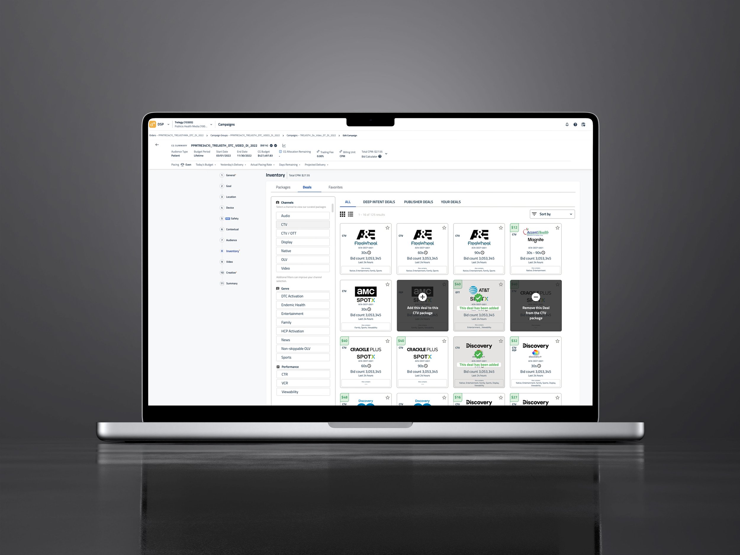
DeepIntent helps healthcare organizations plan and purchase targeted digital ads, but the existing DSP was built around expert media buyers, making the workflow overwhelming for healthcare clients. Variable ad packages, shifting costs, and multiple targeting options created a dense, difficult-to-navigate experience with limited visibility into budget impact.
Healthcare users struggled to compare options, understand categories, and manage durations—all while staying within strict budgets. My goal was to simplify ad package selection, clarify navigation, and create a modern interface that supported fast, confident campaign setup.
01
Reviewing the current state
Site Audit
Complex Ad-Buying Process
Too many steps and scattered decision points made campaign setup slow and difficult.
Budget Constraints
Clients had no effective way to see how ad combinations affected costs or duration in real time.
Sorting & Filtering
Navigation lacked clarity, making it difficult to browse and compare packages by channel, category, or performance type.
Visual Density
Layouts felt crowded, with limited hierarchy and visual guidance for key decision-making moments.
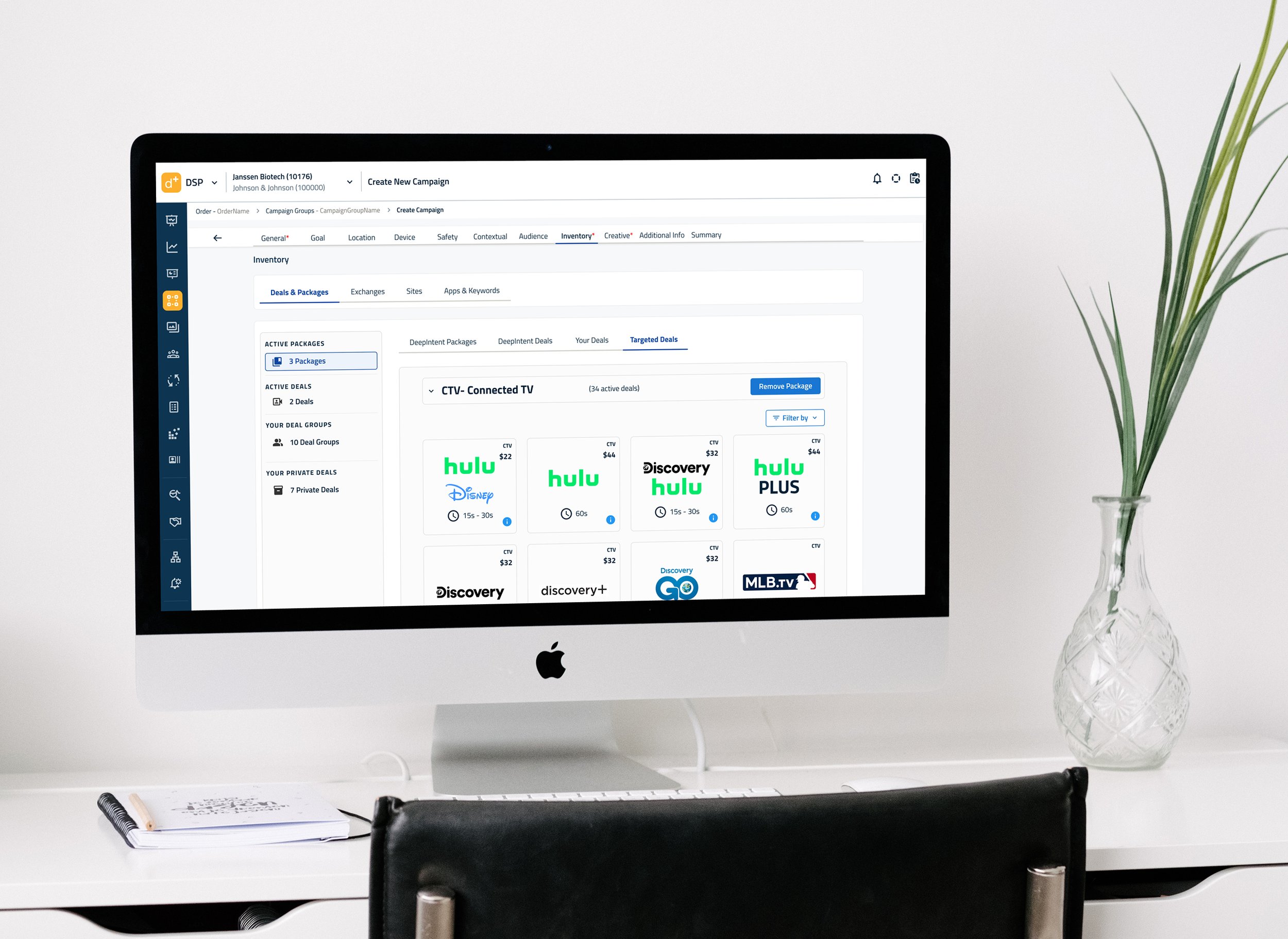
Targeted Deals UI
Mock UI Color Test
Mock UI Color Test 2
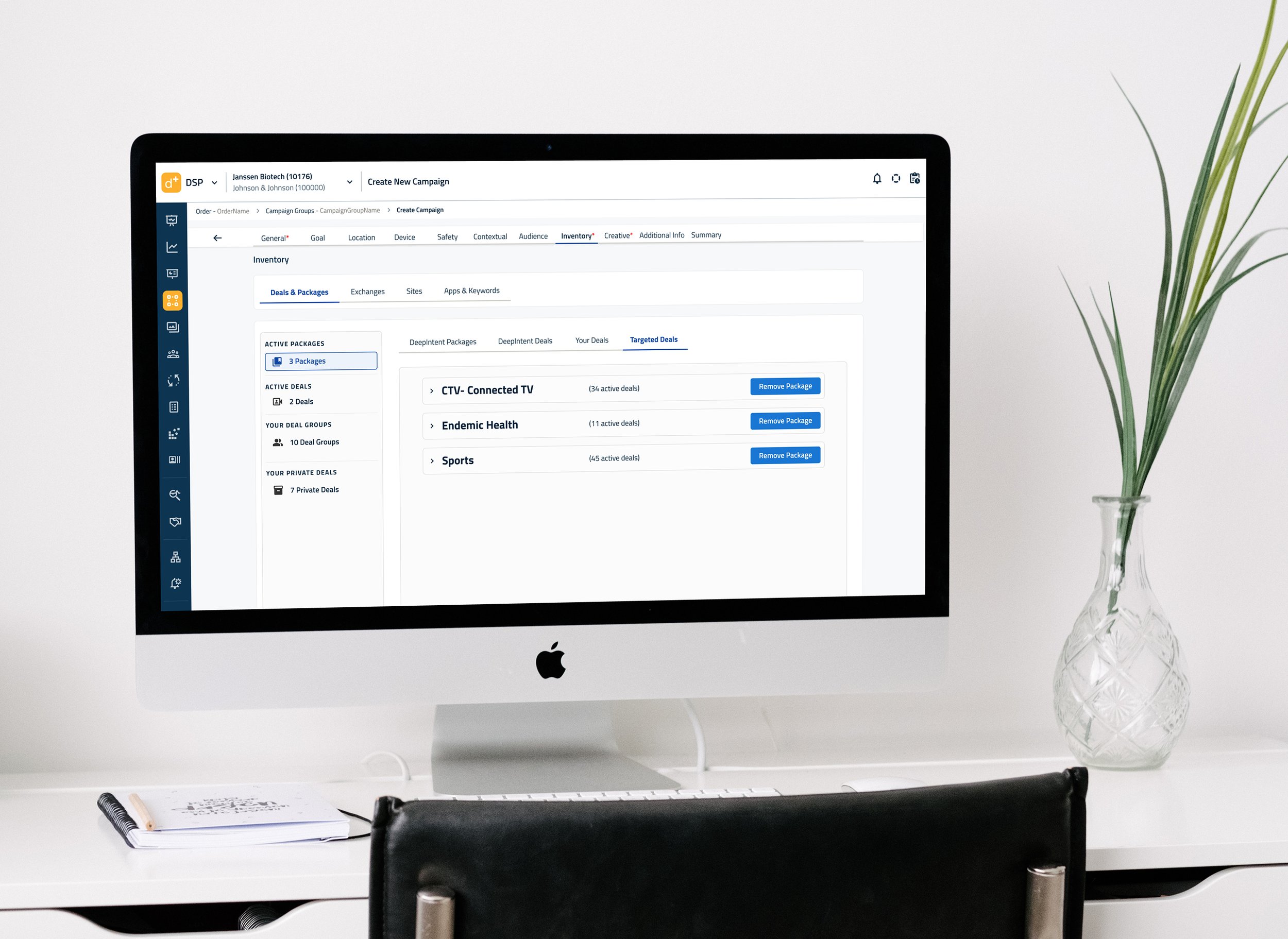
Deals and Packages - Targeted Deals Collapsed State
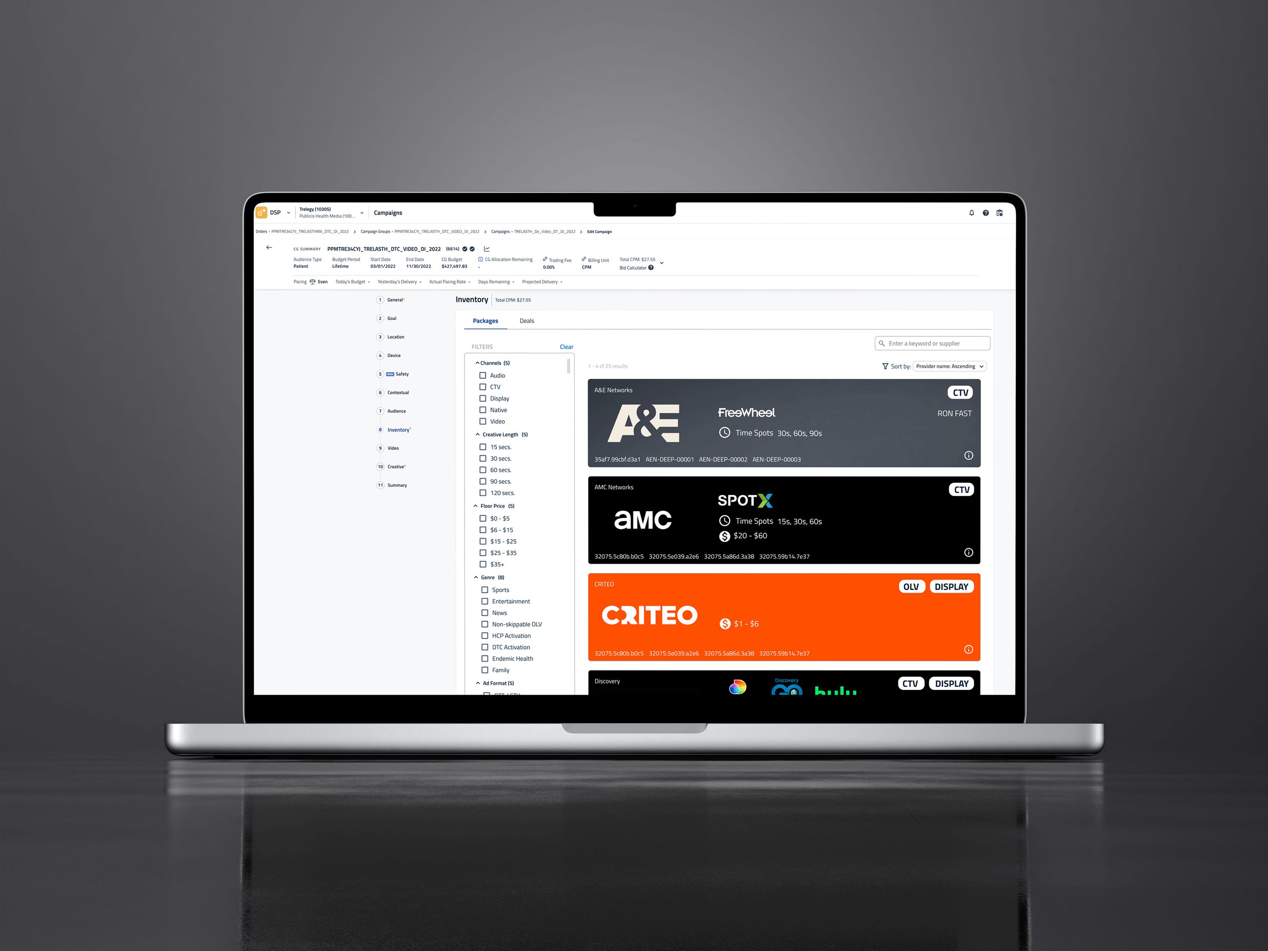
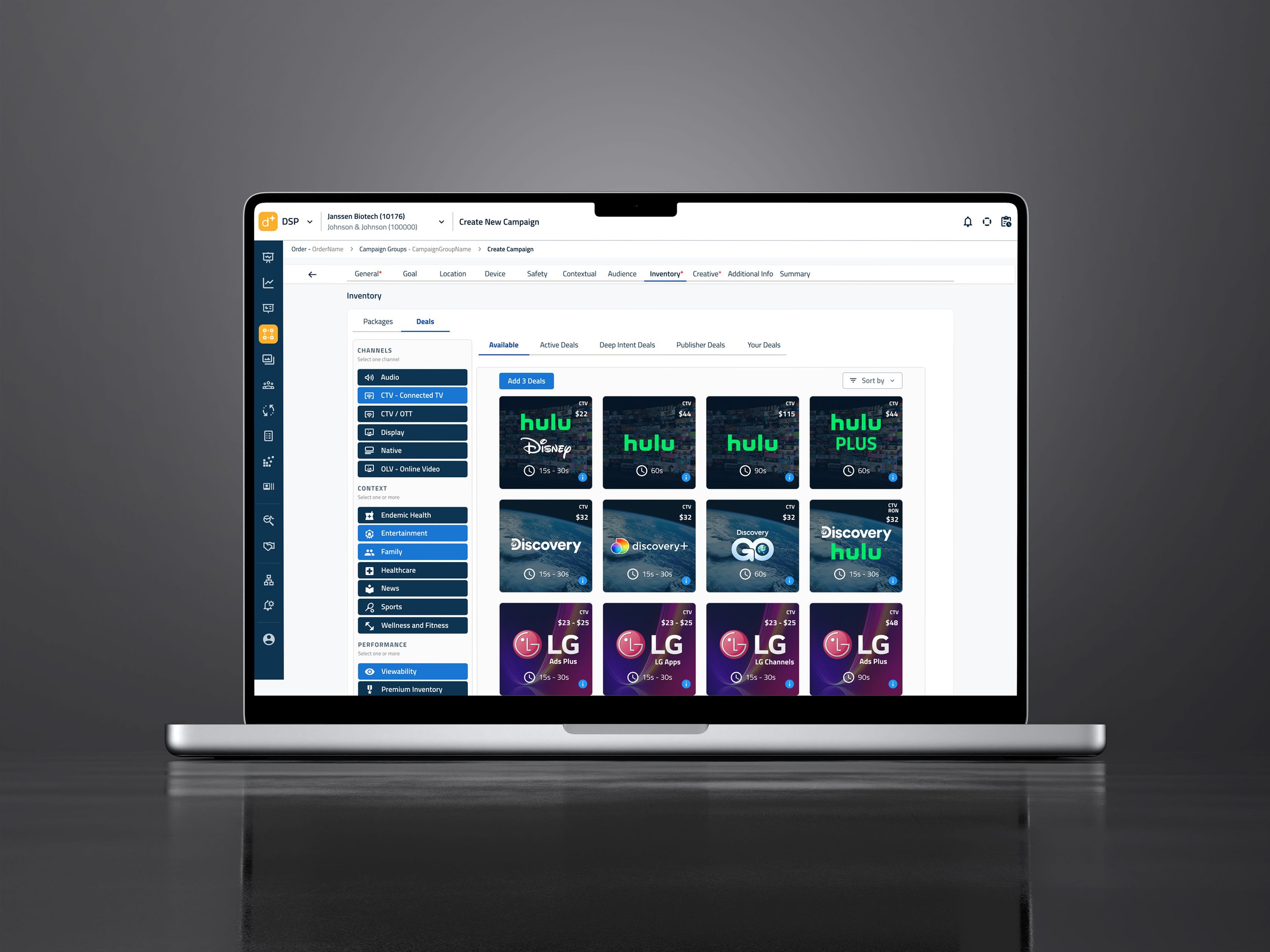
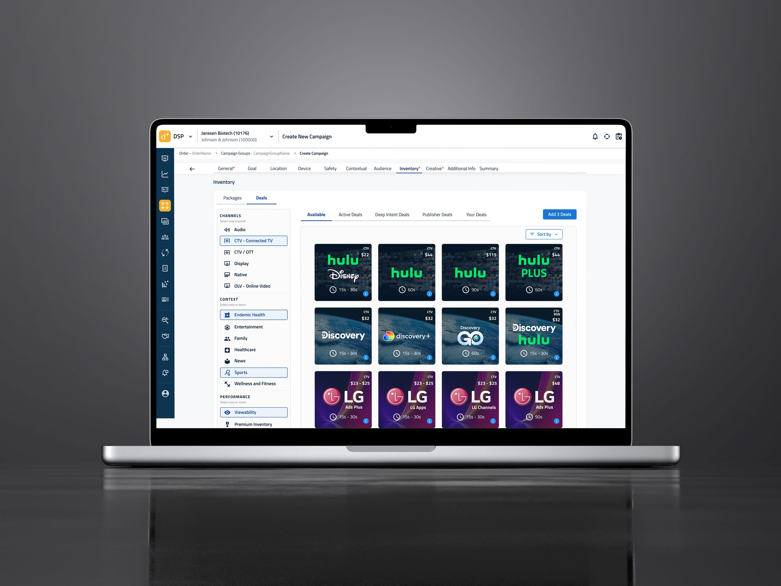
Premium Inventory - Ad Unit Horizontal Test
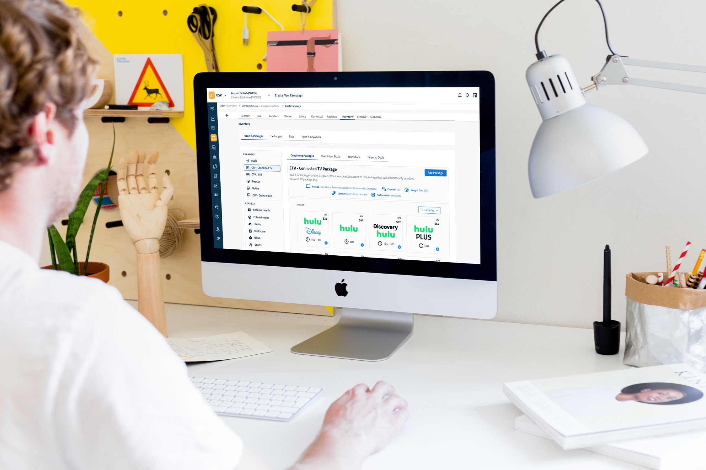
Mid Fi UI Packages White View
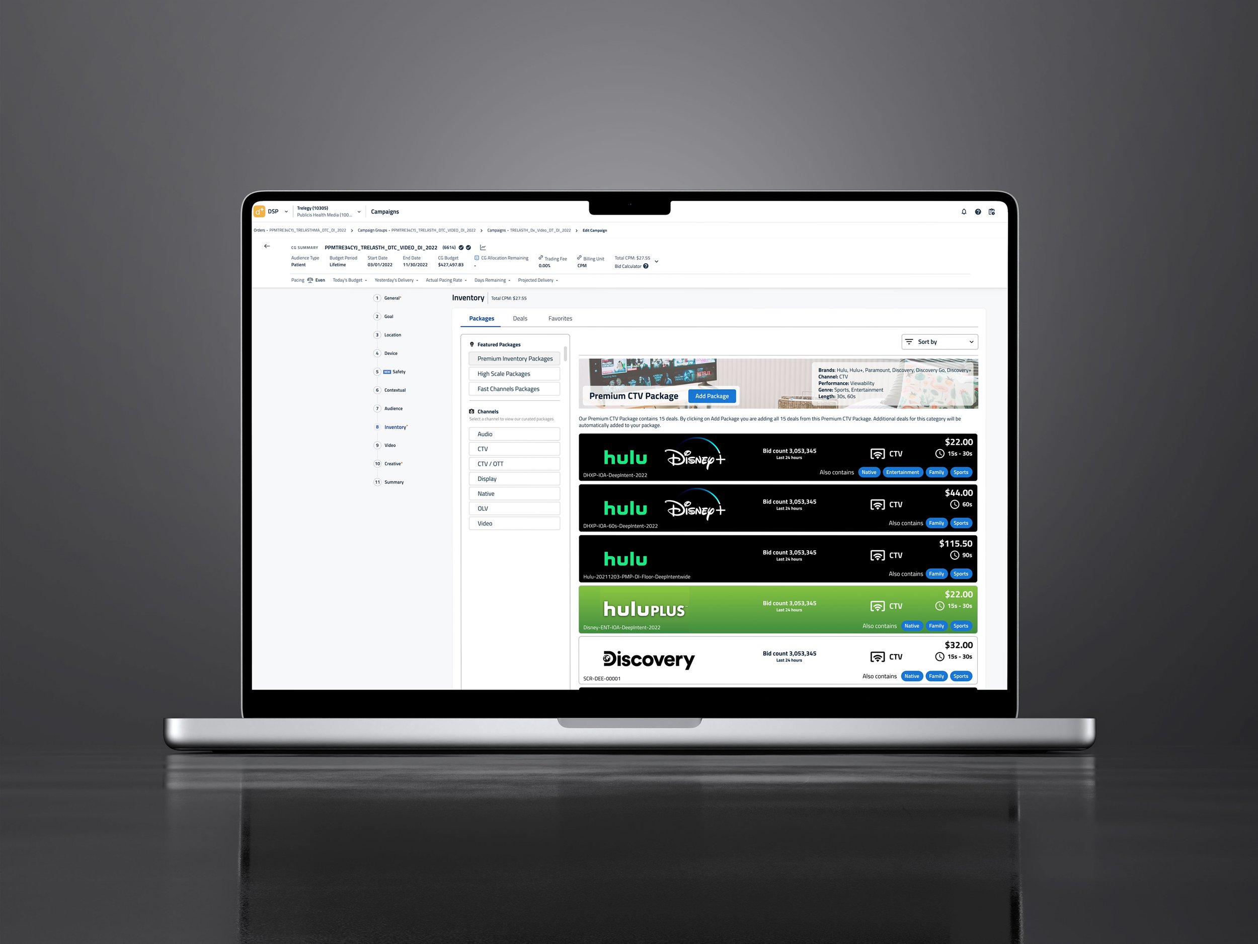
Premium Inventory - Ad Unit Horizontal Test
02
Analysis & Bottlenecks
Understanding the Audience
Healthcare marketers found the DSP unintuitive: selecting ad packages required switching between multiple screens, tracking categories manually, and estimating spend without clear feedback. Variables like channel, cost, duration, and targeting created unnecessary friction.
Applying Occam’s Razor, I stripped away redundant steps and focused on the minimum set of actions required to make smart ad-buying decisions. The result was a more approachable, precise, and intuitive interface tailored to non-expert users.

03
Process & Prototyping
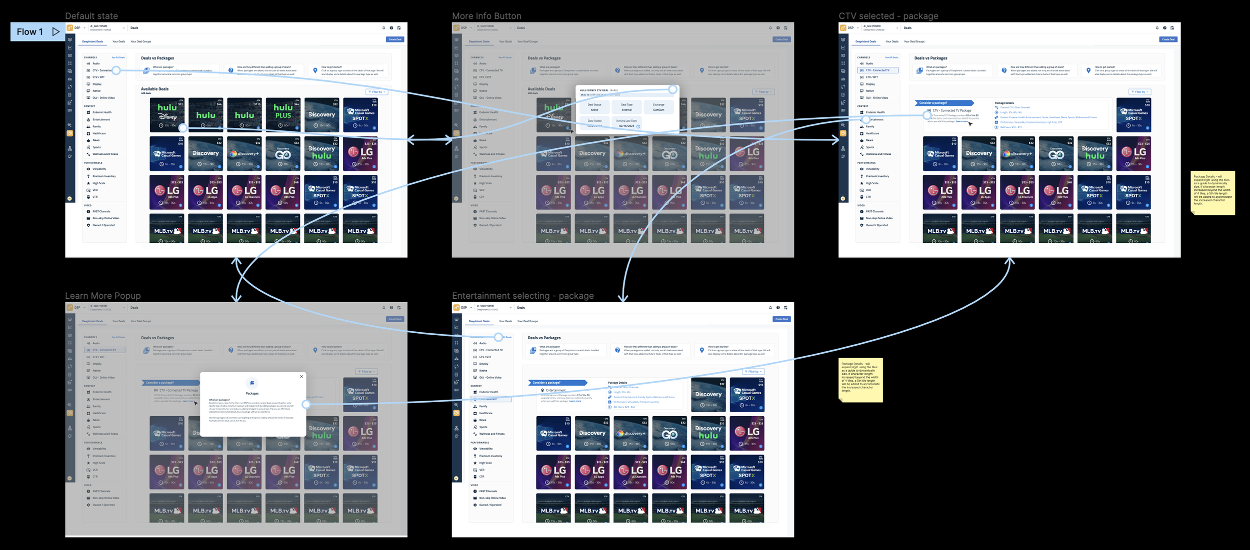
Reducing steps and clarifying primary actions
I used rapid prototyping to test new layouts, validate decision flows, and refine how users compared and selected ad packages. This process emphasized continuity, clarity, and reducing cognitive load.
To streamline the experience, the redesigned prototype introduced:
Clear visual hierarchy for scanning and comparing packages
Intuitive sorting and filtering by category, channel, or performance
Real-time cost and duration visibility to support budget decisions
Consistent interaction patterns across all ad types
These improvements helped clients stay within constraints, understand trade-offs, and feel confident in their final selections.
04
Outcome & Impact
A more modern, scalable, and healthcare-friendly DSP
The redesigned interface enabled healthcare clients to select, compare, and purchase ad units faster and with greater clarity, reducing friction across the entire workflow.
Streamlined Ad Buying
Simplified steps and clearer navigation supported faster setup and fewer points of confusion.
Budget Confidence
Real-time cost and duration feedback helped clients stay on budget without guesswork.
Scalable Layouts
Modular UI patterns ensured the design extended cleanly across channels, packages, and new offerings.
Modernized Visual System
Improved clarity, color balance, and spacing created a professional visual identity that matched healthcare expectations.