DeepIntent
DeepIntent is a healthcare advertising platform that enables users to plan, activate, measure, and optimize programmatic campaigns. Leveraging real-world health data, it predicts patient and HCP reach by channel and data provider.
I was brought in to enhance the existing DSP (demand-side platform) B2C interface, improving audience metrics, budget management, and accessibility for a broader range of internal customers.

Agency
DeepIntent
Role
Sr. Lead Product Designer
Services
UI/UX, B2C SME
Demand Side Platforms
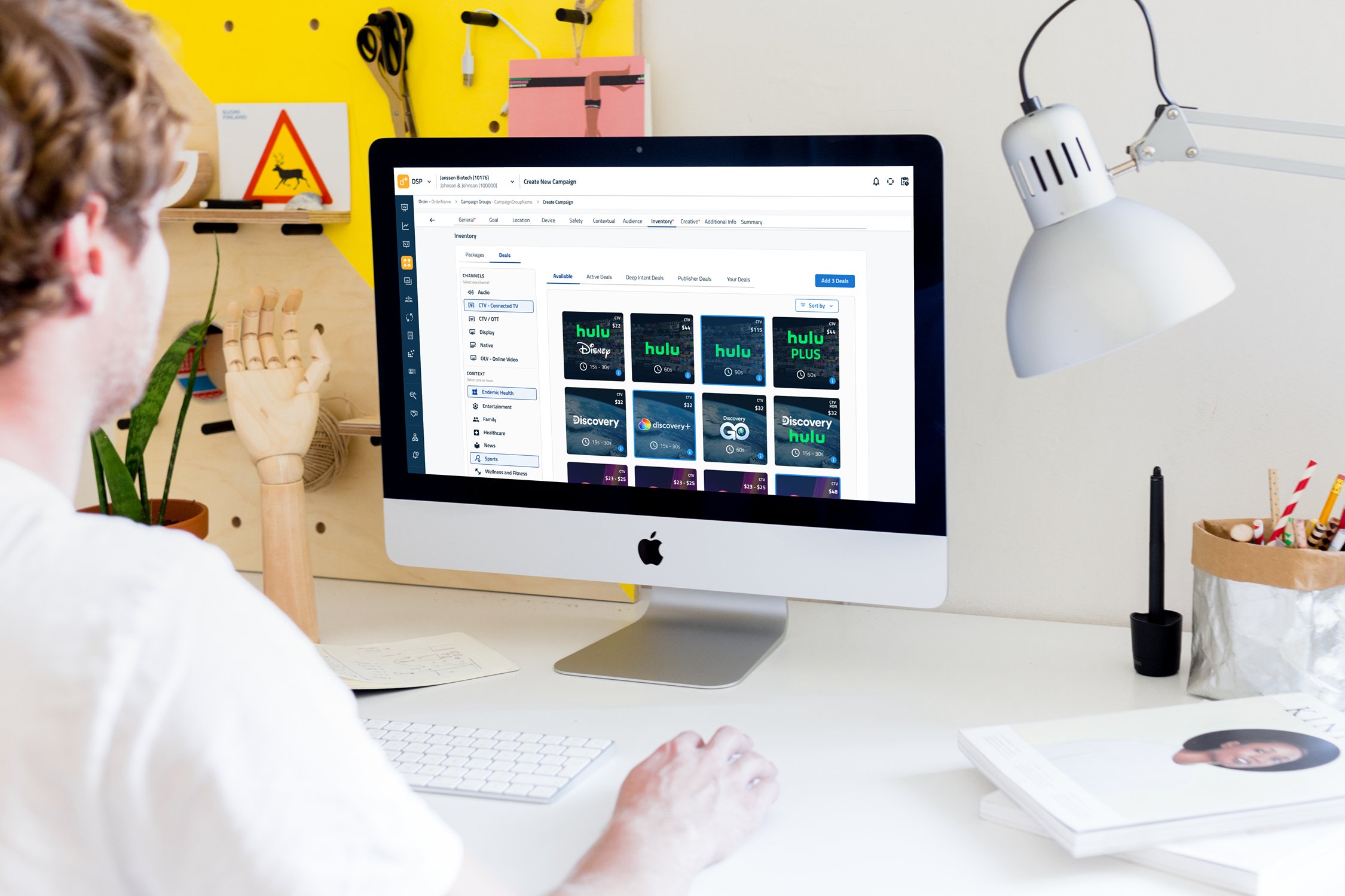
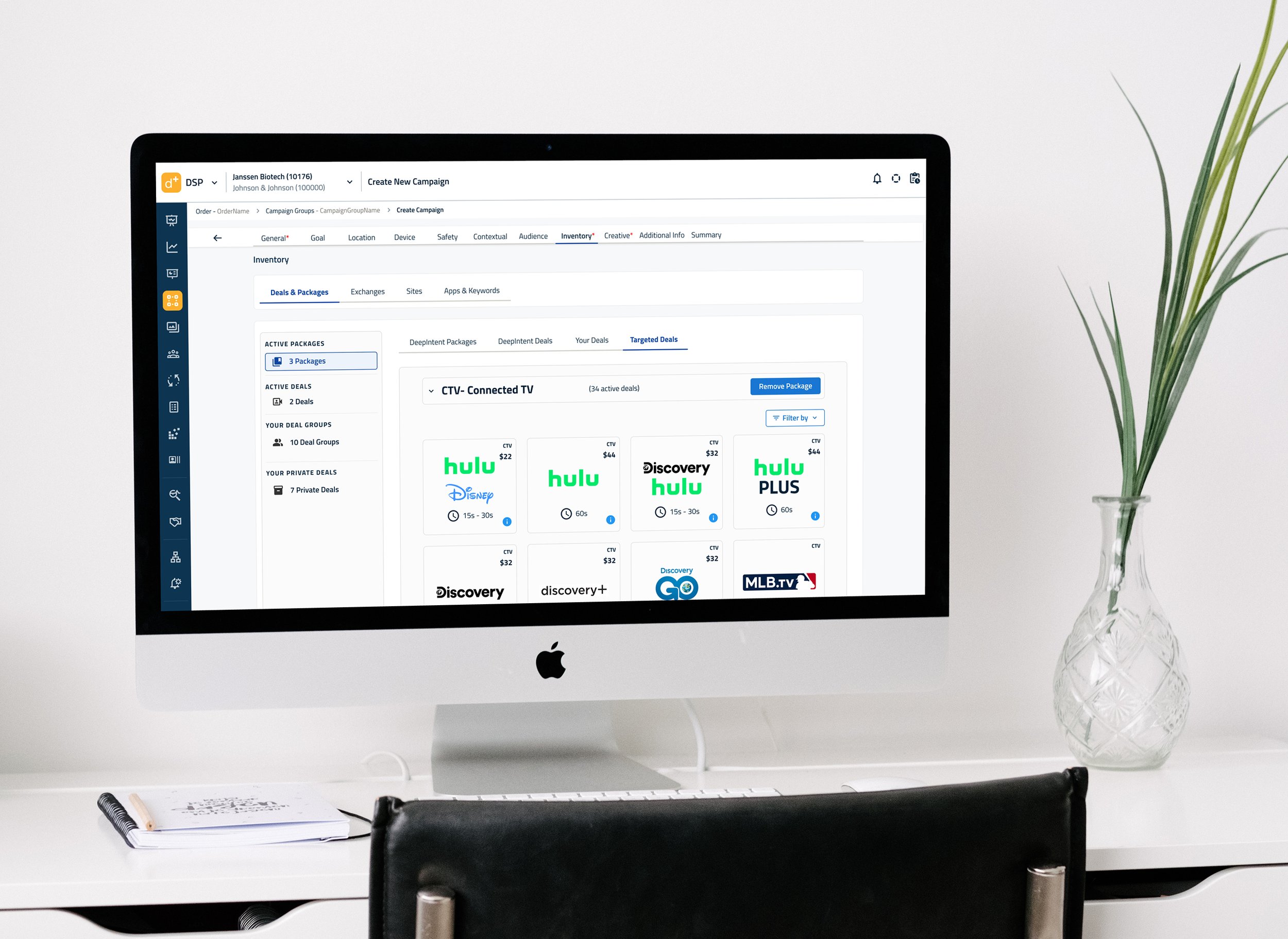
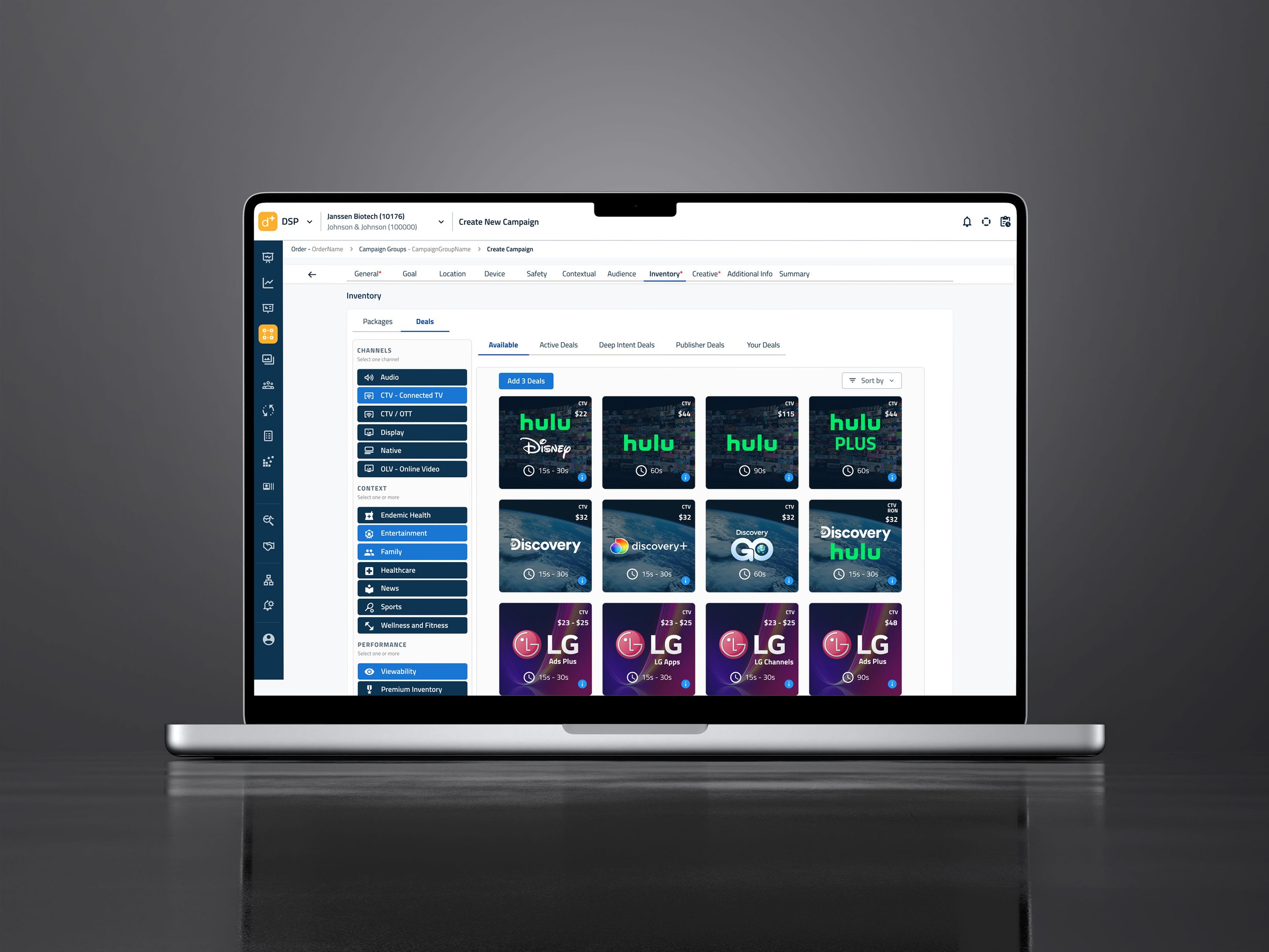
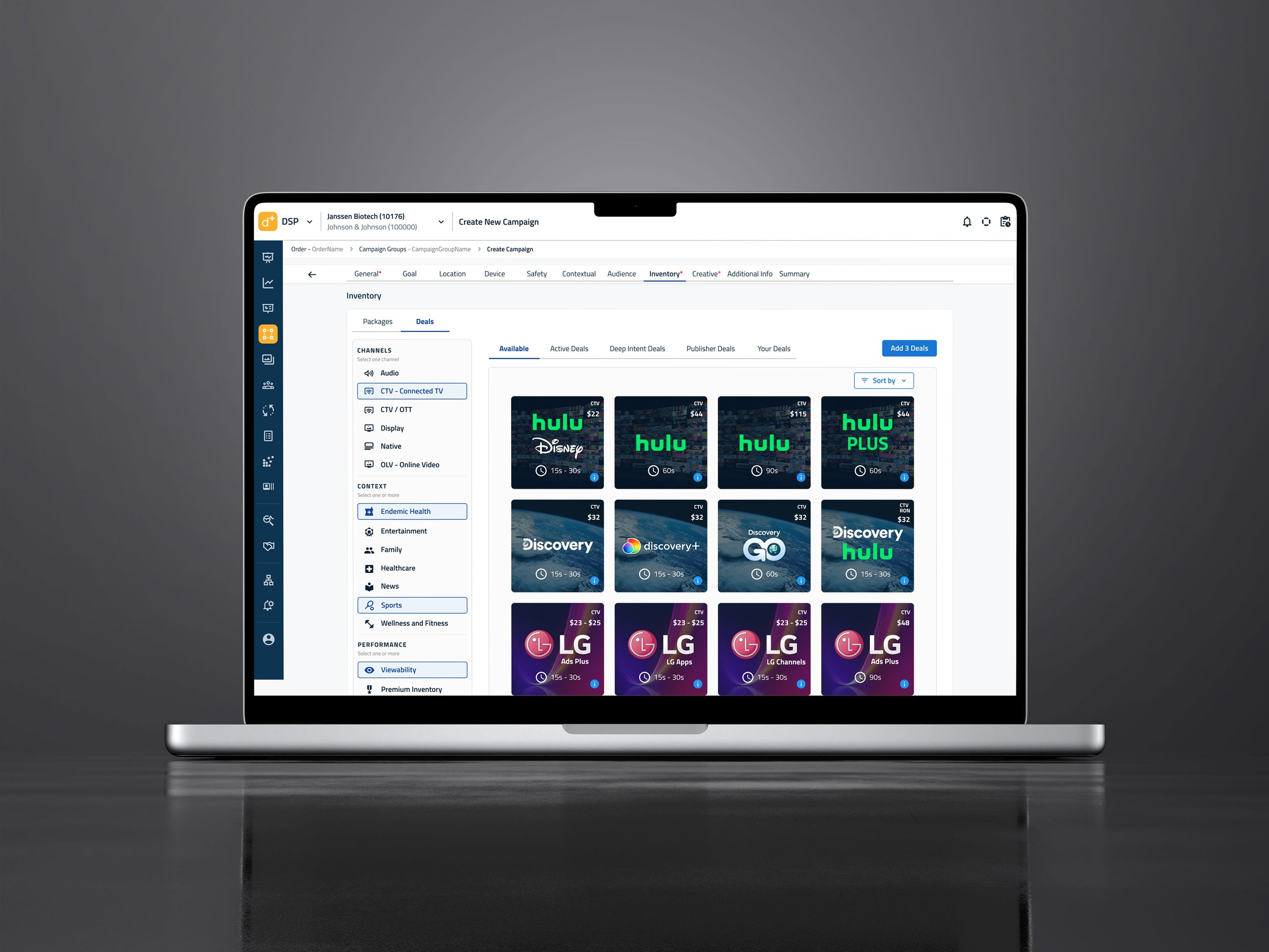
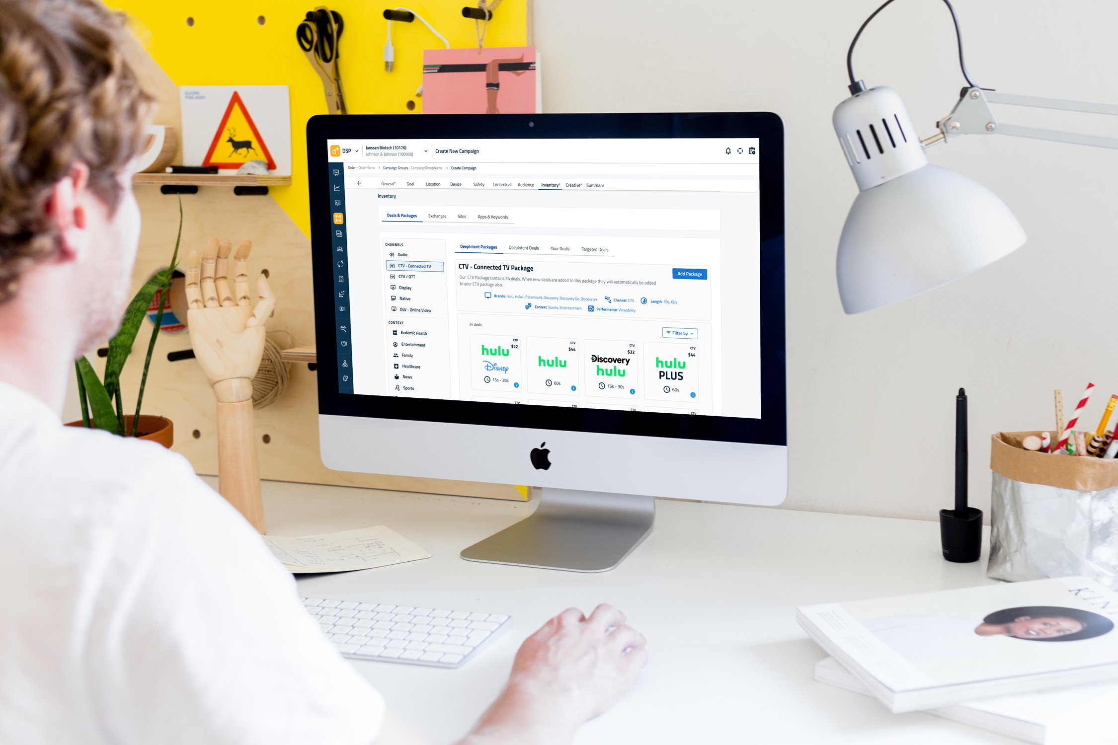
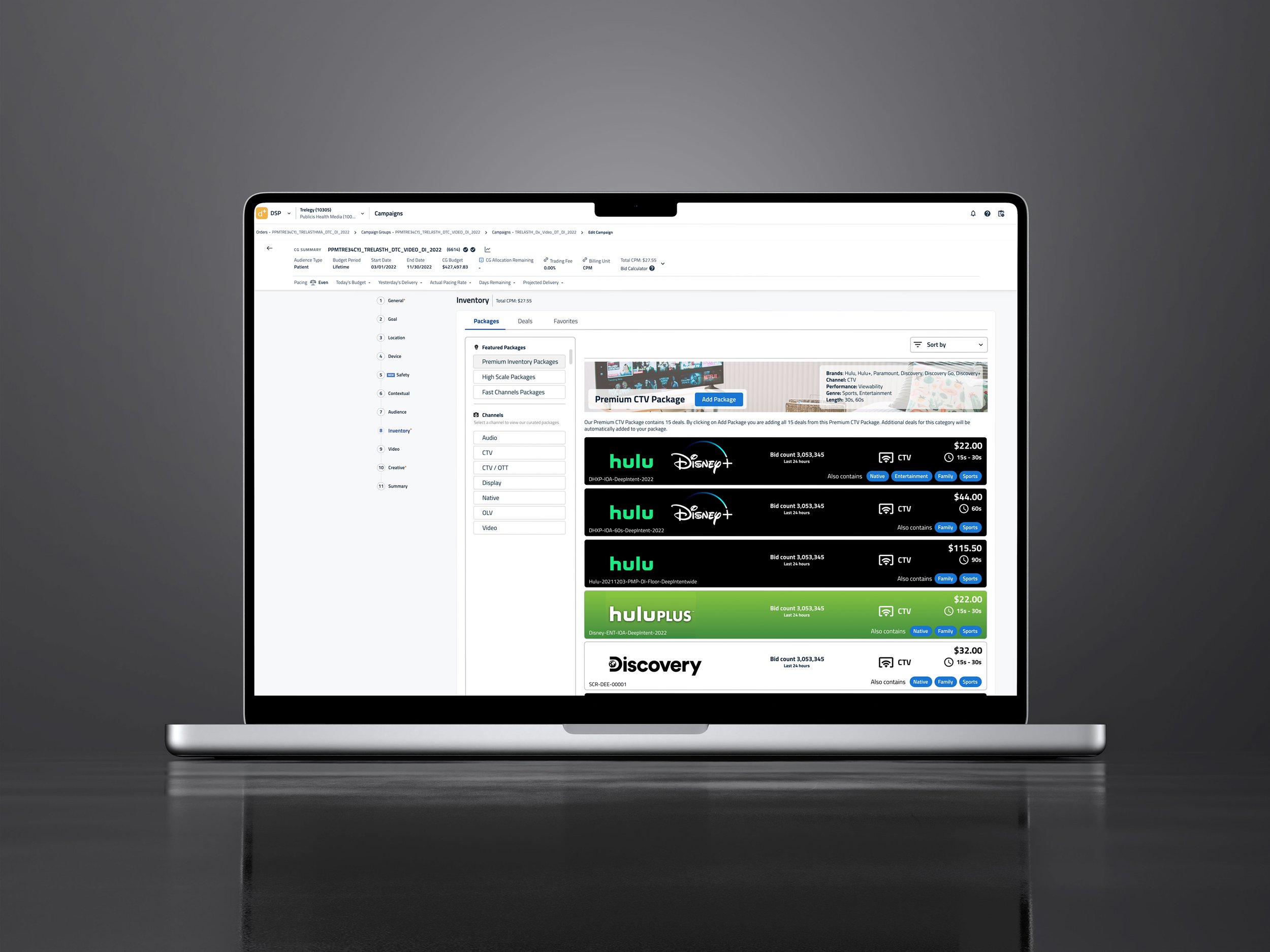
DeepIntent specializes in healthcare ad sales, but clients often struggle to navigate the complex process of purchasing targeted ads. They need simple ways to sort and find specific channels, view categories of ads, understand costs, and manage ad durations, especially when working with specific budgets.
This prototype UI demonstrates how visual ads can be presented to help clients select better-targeted ad units within their budget constraints.
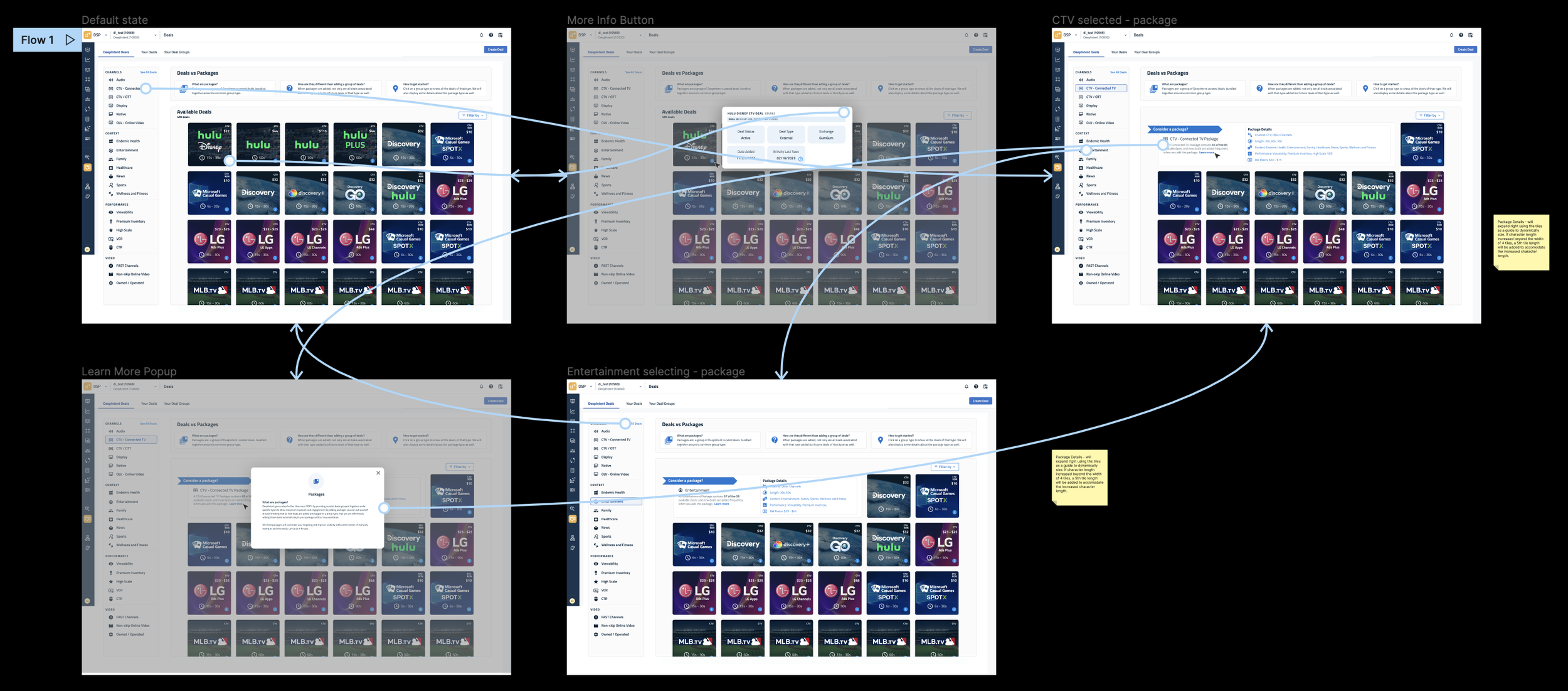
Most projects begin with wireframes to define interactions and establish the overall look and feel. In this case, the wireframe appears on the left, with the polished mockup pitch design on the right. After capturing the core requirements through wireframing, I created high-fidelity mockups to help scale the solution effectively.
Through prototyping and multiple iterations, the UI evolved based on continuous feedback and testing. I explored layout options such as horizontal bars versus tiles to determine which scaled best while keeping the design visually engaging. A/B testing different color treatments against minimalist approaches provided valuable insights into what resonated with the target audience. Final design decisions were guided by long-term goals and cross-functional input to ensure the UI aligned with both user needs and business objectives.
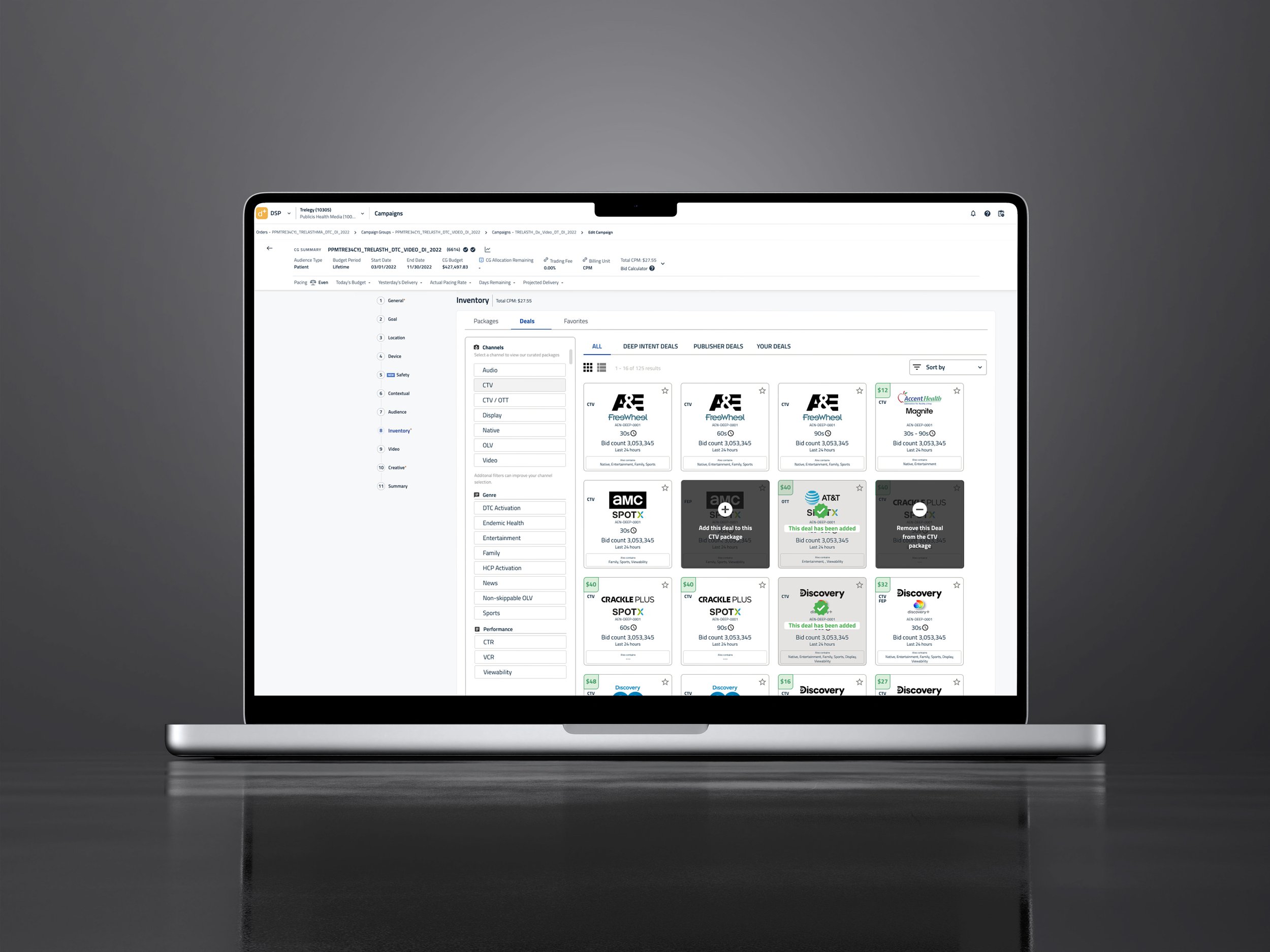

I used standard design processes from discovery through commercialization. I drew inspiration from e-commerce platforms that allow easy left-side navigation sorting. To scale this UI effectively, I designed it with sort navigation on the left and real-time content updates on the right. Display tabs at the top let users switch modes or groups of ads. I included primary and secondary action buttons in distinct colors to clearly guide customer actions. By applying Occam's razor principles, I simplified a complex UI into an intuitive experience.
Targeted Deals UI
Mock UI Color Test
Mock UI Color Test 2
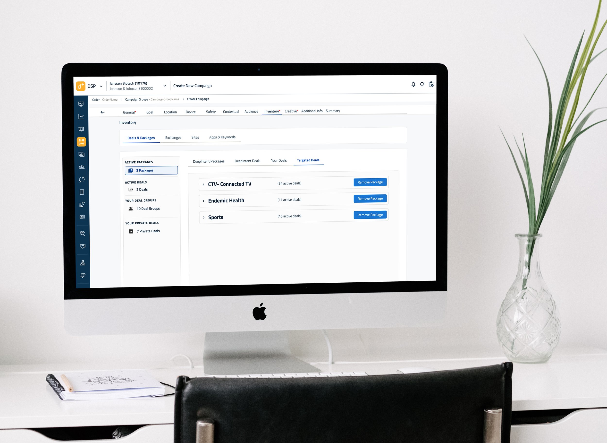
Deals and Packages - Targeted Deals Collapsed State
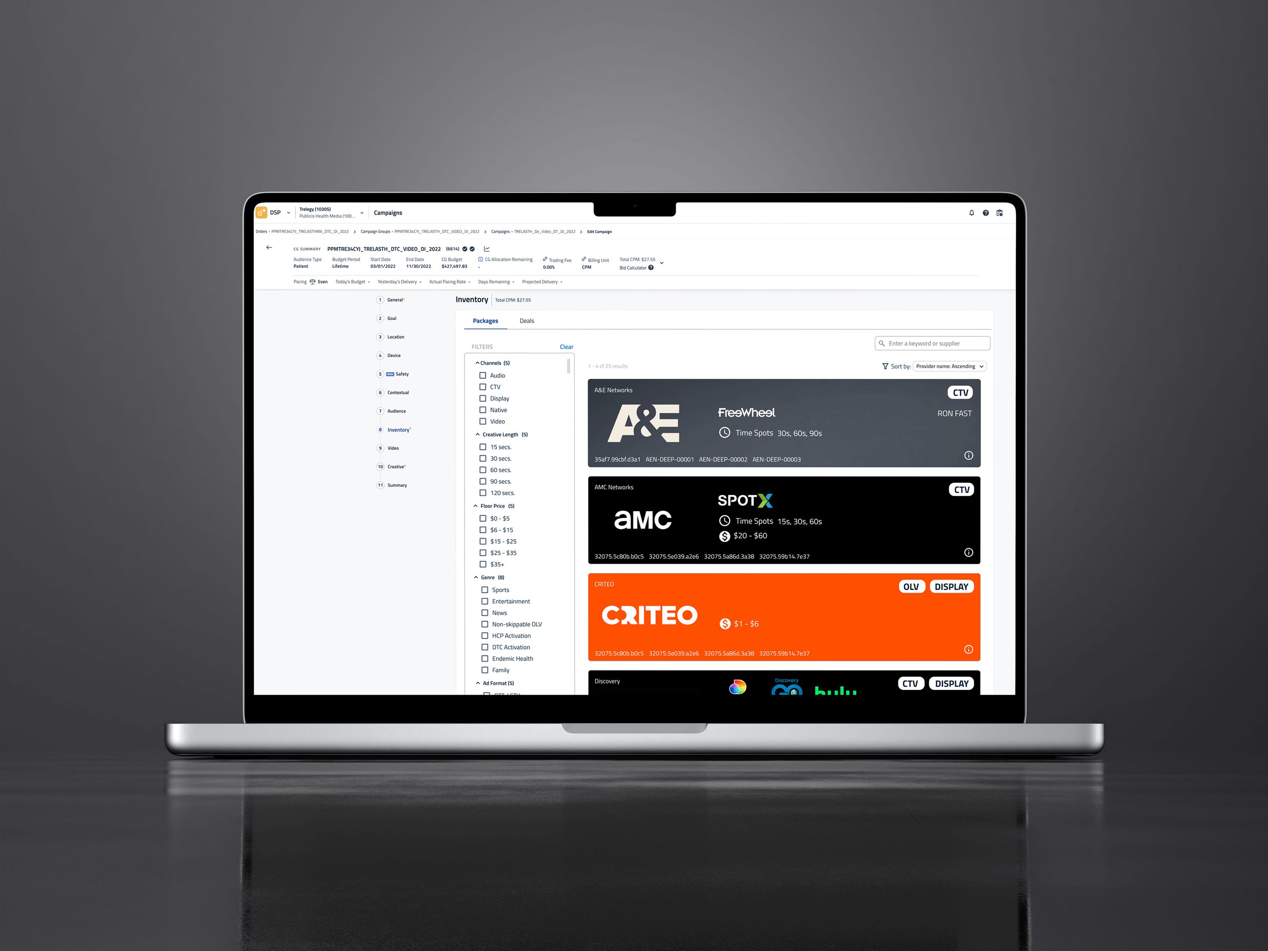
Premium Inventory - Ad Unit Horizontal Test
Mid Fi UI Packages White View
Premium Inventory - Ad Unit Horizontal Test

Extensive prototyping was used to reduce clicks and improve the overall user experience, with snippets like the one below incorporated throughout. This particular snippet highlights features linked to different advertising offers, demonstrating the connectivity, flow, and storytelling in the design.