
Context: Automotive retail experience redesign for the U.S. market
Role: Product Designer · UX Consultant
Timeline: 2011
Fiat
Designing a modern, U.S.–ready car configurator for clarity, flexibility, and brand impact
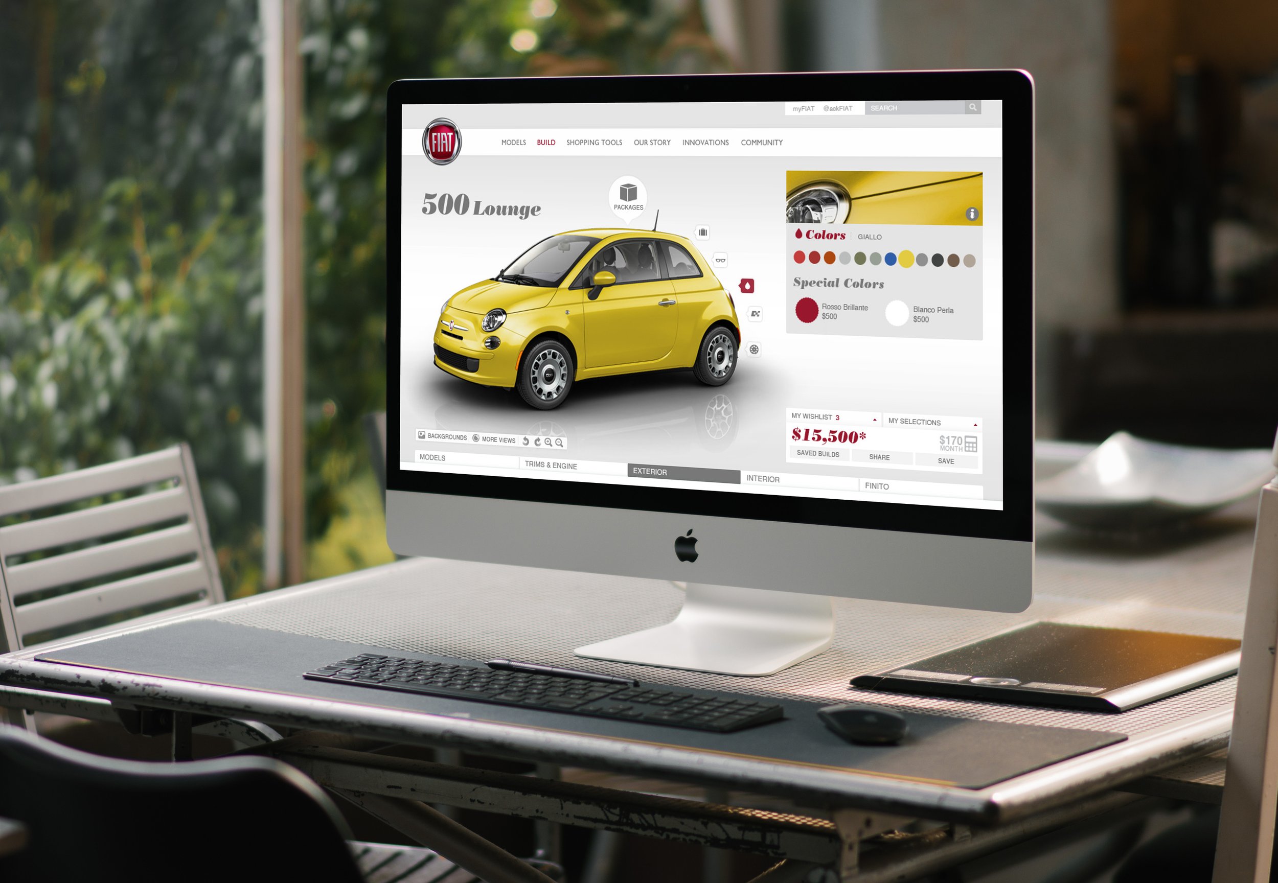
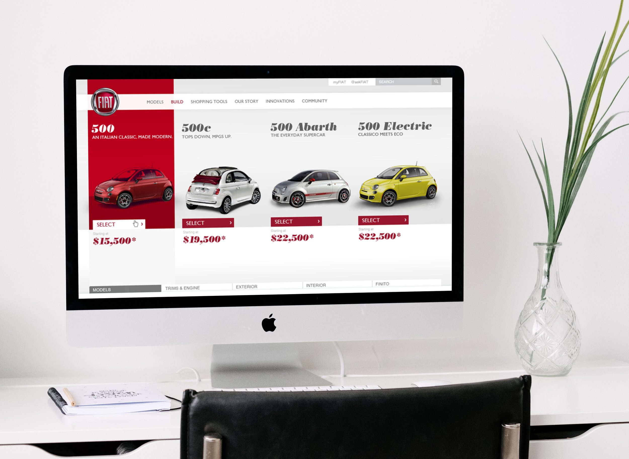
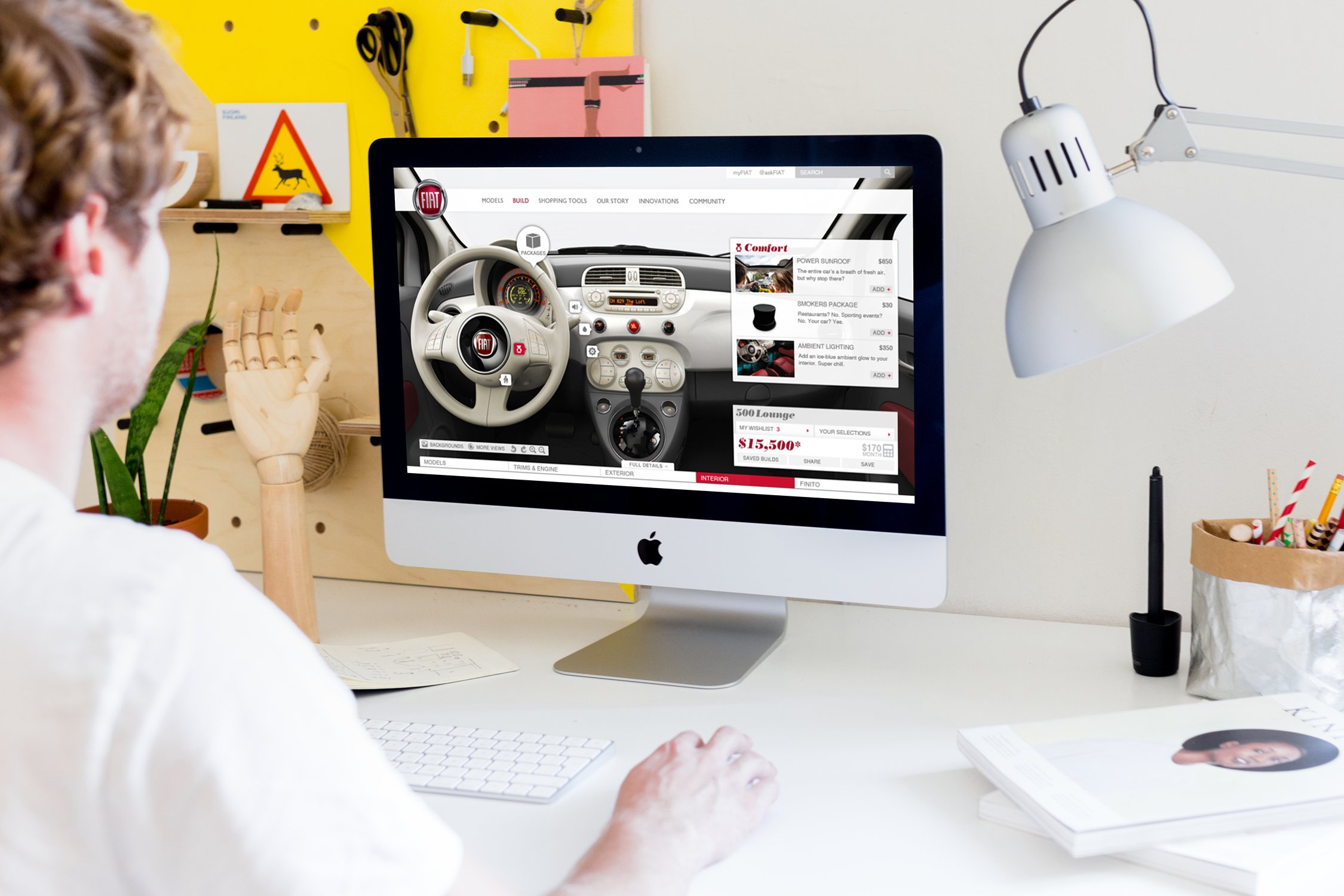
Fiat needed to adapt its European car configurator for the U.S. market, where shoppers expect more freedom, clearer pricing, and stronger visual storytelling. I redesigned the experience to support non-linear navigation, transparent comparisons, and more expressive product imagery—creating a faster, friendlier, and more intuitive way for customers to customize a Fiat 500.
01
Understanding the opportunity
Key Findings
Non-linear navigation expectations — U.S. customers preferred to skip between steps rather than follow a strict wizard.
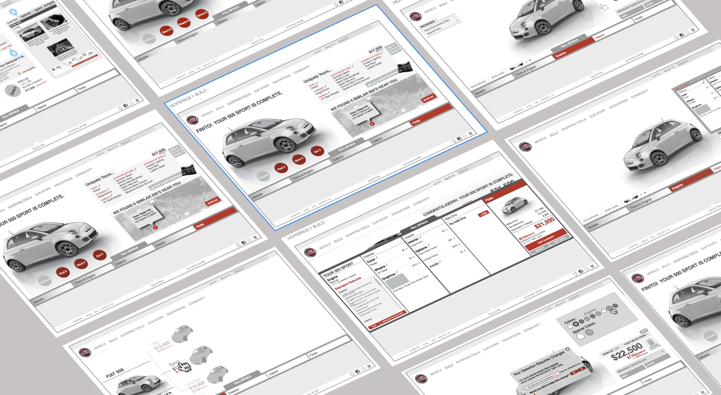
Configuration conflicts — Users needed a clearer way to understand what options were added or removed as they made changes.
Younger target audience — Research revealed the demographic skewed younger than Fiat expected, shaping tone and usability decisions.
Stronger visual storytelling — Customers relied heavily on product photography to understand features and feel connected to the brand.

02
Discovery & user insights
What we Learned
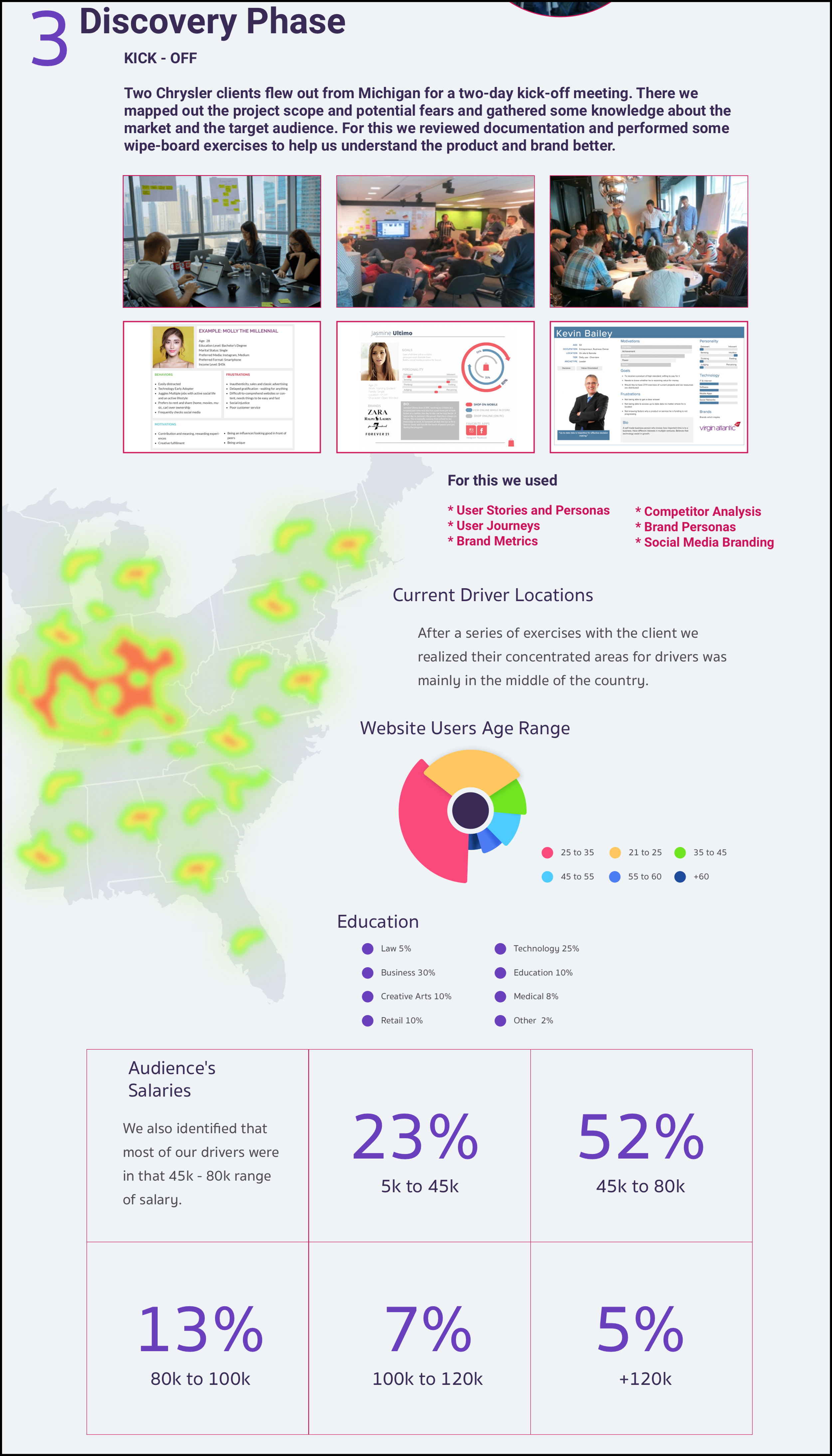
Current driver locations — Heat-mapping revealed most Fiat drivers were centered in Midwest and coastal regions.
User demographics — Majority fell within the 25–45 age range with broad variance in income and education.
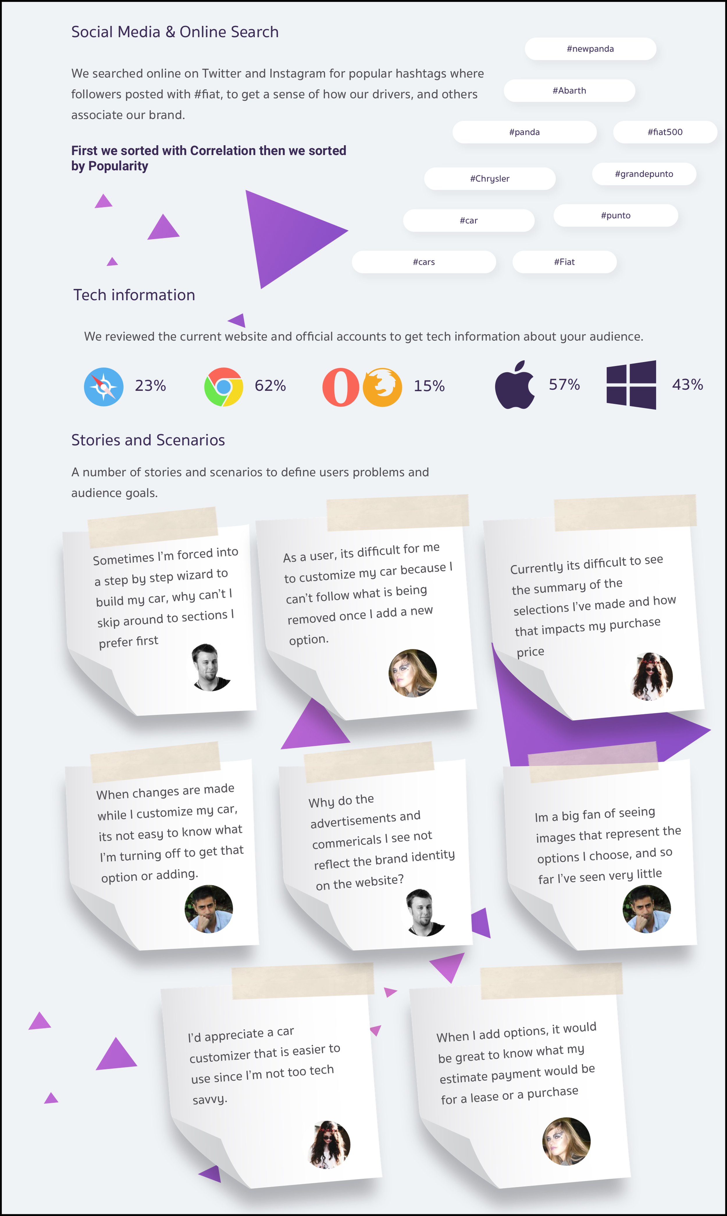
Social & online behavior — Hashtag and content analysis showed users were image-driven and brand-expressive.
Browser & device data — Chrome dominated; Apple and Windows were nearly evenly split—requiring cross-platform refinement.
User pain points — Themes included difficulty understanding what changed during customization, desire for better summaries, and need for clearer financial indicators.
03
Translating research into structure
Design Principles
Freedom to explore — Users needed a flexible browsing path rather than a forced sequence.
Clear option feedback — Every selection needed immediate visual and textual clarity.
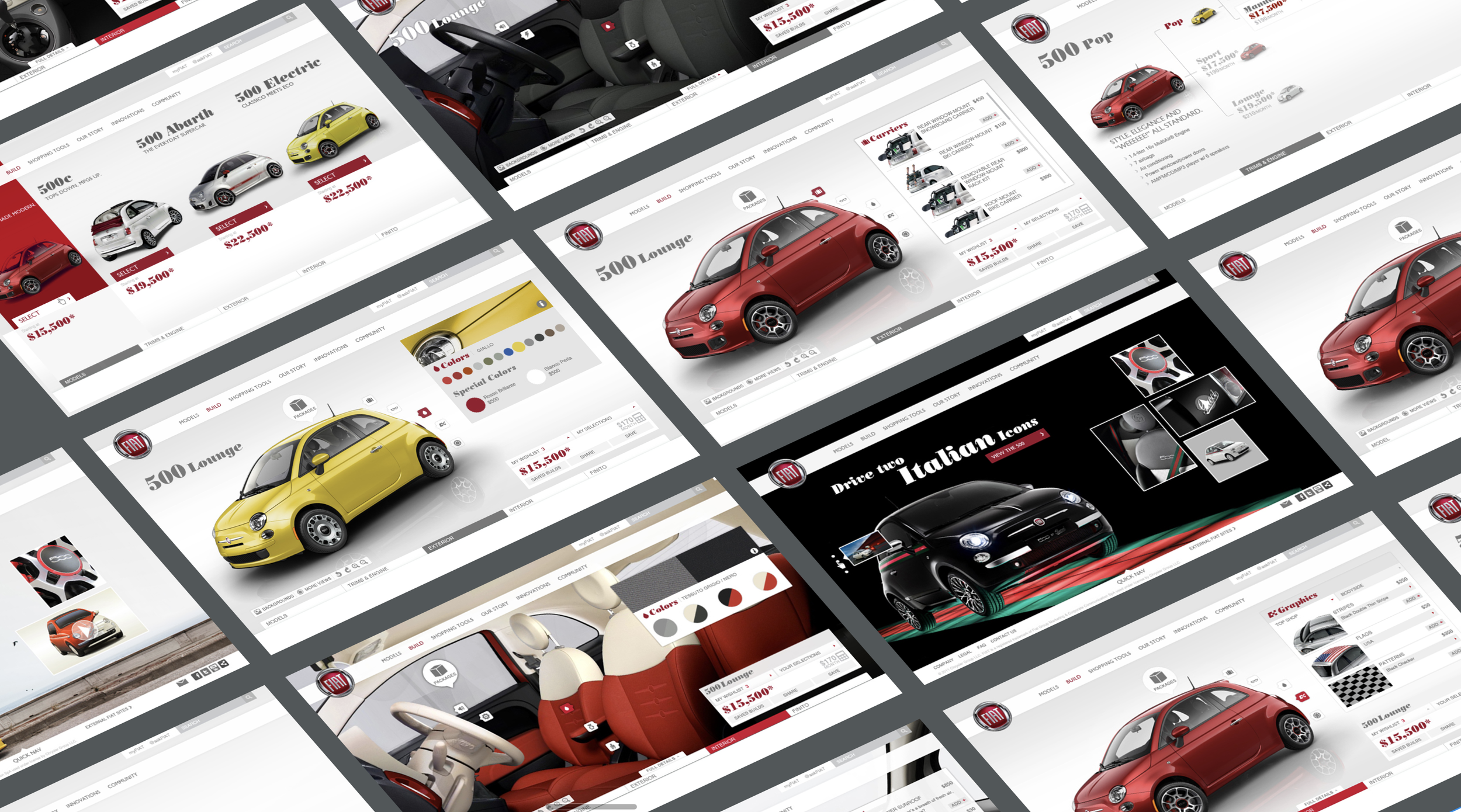
Quadrant-based layout — A balanced composition (image left, options right, progress bottom) made navigation intuitive.
Maintain brand personality — Young, playful, expressive visuals paired with clarity in function.
A case study highlights the team’s process—how research shapes decisions, how challenges are solved, and how requirements evolve in real time. It also clarifies the key takeaways that guided the final experience.
You can explore the full case study below or download the PDF.


04
Building and refining the experience
What we Delivered
Mid-fidelity wireframes — Dozens of flows covering model selection, trim comparison, conflicts, and accessory paths.
Usability-driven adjustments — Iteration focused on clarity during configuration conflicts, option visibility, and navigation speed.
High-fidelity mockups — A polished, photo-forward experience that emphasized product personality and simplified decision-making.
Flexible system foundations — While not a full design system, core reusable patterns were defined for layout, feedback states, and interactive elements.