
Context: White-Labeled Mobile Banking Platform
Role: Sr. Product Designer
Timeline: 2023
Deloitte Digital
Reimagining a 0–1 white-label banking app that made everyday money tasks feel faster, clearer, and actually enjoyable.
Deloitte Digital partnered with Matic Digital to build a mobile banking app that could be rebranded and deployed across multiple financial institutions. The challenge wasn’t adding more features—most banking apps technically work—the real problem was that simple tasks were buried behind too many taps, menus, and confusing decision points.
We set out to design something different: a mobile-first banking experience where the fundamentals felt obvious, predictable, and effortless. A platform that clients could customize without breaking the UX, and one that users could trust immediately.So that’s what I designed.

01
Understanding the Current Needs
Why Simple Banking Felt Hard
Before designing anything, I audited the apps people rely on most—Revolut, Monzo, Truebill, Stash, and several regional banks. The pattern was clear: the “basics” weren’t basic.
Too many steps to send money
Confusing flows for linking accounts
Disputes hidden behind unclear paths
Navigation that felt like guessing
For a 0–1 banking product to gain trust quickly, the fundamentals needed to feel obvious, predictable, and effortless.
02
Identifying Key Friction Points
Where Users Struggled Most
Research and competitive analysis revealed the core issues shaping our build: dense forms, inconsistent flows, and no mobile-first logic.
Tasks like funding, onboarding, and account linking carried unnecessary clicks and unclear guidance. White-label constraints also meant every variation risked breaking consistency.
We needed a foundation that reduced cognitive load, streamlined essential actions, and supported multiple clients without extra rework.
Mapping each feature flow and reducing steps was critical in making the experience easier than other standardized banking apps.

03
Designing a Modern Mobile Experience
Making Banking Feel Simple
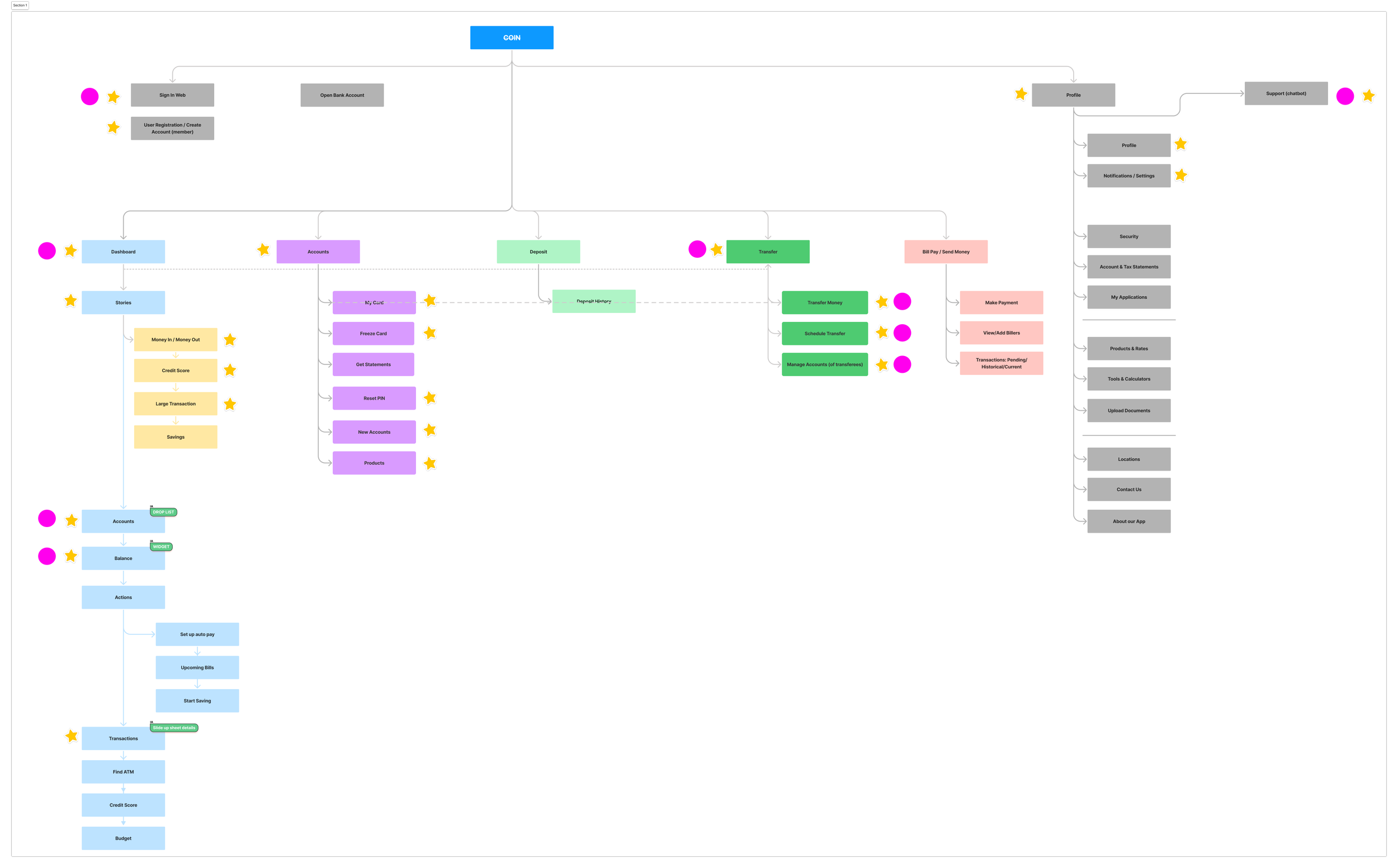
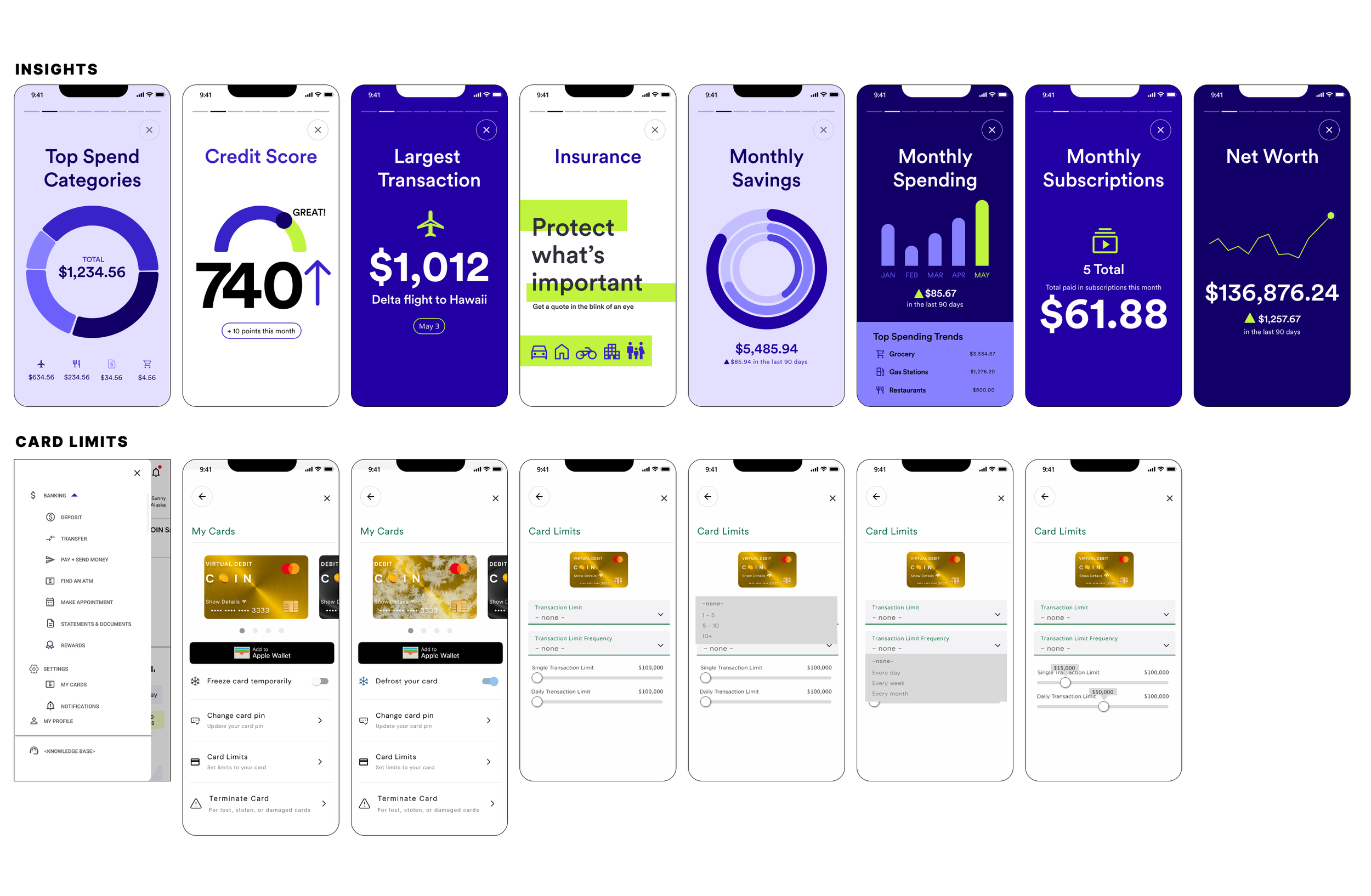
The design approach centered on creating a mobile-first experience where complex financial tasks felt fast and intuitive.
I built streamlined flows for KYC, funding, transfers, and linking accounts. A token-based design system enabled reusable components, easy rebranding, and tighter dev alignment.
A modern visual language—rounded tiles, clear hierarchy, airy spacing—helped the app feel trustworthy and friendly to a younger audience.


04
Results & Impact
A Scalable, Client-Ready Platform
The COIN MVP launched as a flexible, white-labeled banking system ready to support multiple financial institutions.
We simplified core banking actions, reduced friction across key tasks, and accelerated engineering through a reusable design system.
The result was a cohesive, mobile-native foundation that balanced clarity, usability, compliance, and cross-client scalability.